Accessible Premium Ecommerce: Restraint That Still Works for Everyone
How to design an ecommerce store that feels premium and remains accessible: contrast, readable type, visible states, honest content, motion, and testing with real tools.
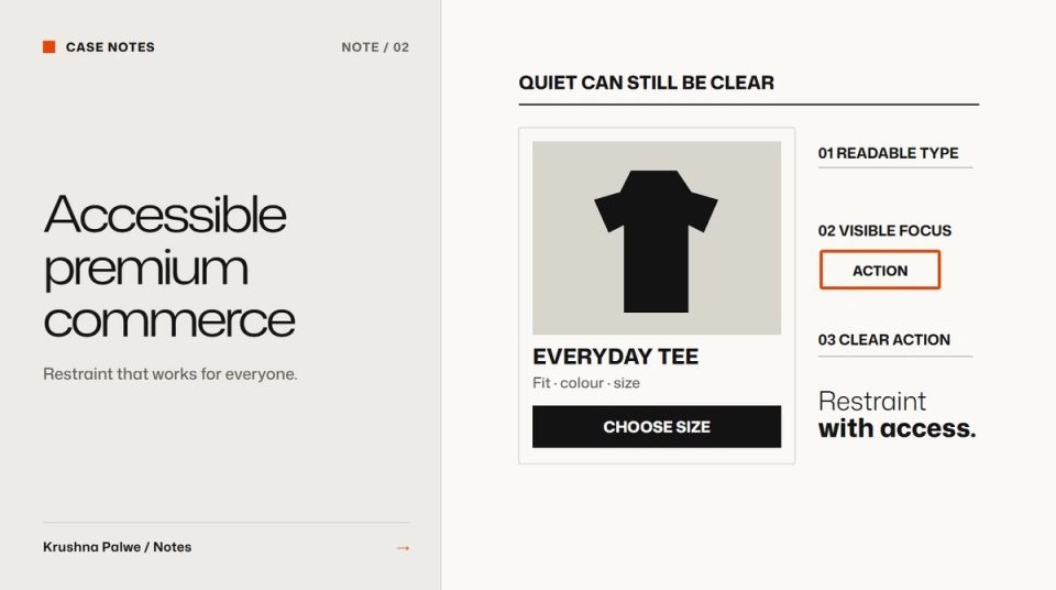
Premium ecommerce often borrows its look from print: pale grey type, tiny uppercase labels, thin rules, low-contrast buttons, images with no text at all. In a magazine that can feel refined. On a phone in sunlight, it makes the store hard to use for many shoppers, and frustrating for nearly everyone. Accessible ecommerce design is not the opposite of premium. Done well, it is what makes restraint feel confident instead of fragile.
I designed BLANKSY's identity and Shopify storefront with that balance in mind. The identity is monochrome first, with one action colour and heavy grotesque headlines. The storefront was checked with Shopify's Theme Check and the axe accessibility engine, and every colour pair in the identity has a measured contrast ratio and an approved job.
Premium comes from restraint, not from low contrast
What makes a store feel considered is usually:
- Fewer elements per screen, each with space around it.
- A small, consistent palette.
- Confident typography at clear sizes.
- Consistent photography across the catalogue.
- Honest, specific product information.
None of those require pale text or invisible buttons. Low contrast is a shortcut to looking minimal, and it costs usability. Keep the restraint, and keep the contrast. Body and secondary text should exceed 4.5:1, and buttons, inputs and focus indicators should meet 3:1 against their surroundings. Accessible colour pairs covers how to document that.
Make type readable at real sizes
Small uppercase labels with wide tracking are a common premium cliché. Used for a short category label, they are fine. Used for prices, sizes or delivery information, they slow everyone down. Rules:
- Product names, prices and options at comfortable reading size on a phone.
- Uppercase only for short labels, never for sentences.
- Body text at 16 pixels or more, with generous line height.
- No light weights for informational text.
The general settings are in readable body text on the web.
Show states clearly
Minimal interfaces often hide state. A selected size indicated only by a slightly darker outline, or a link that looks identical to text, makes shoppers guess. Make every state visible:
- Selected options with a clear, non-colour-only indicator.
- Focus states visible on every interactive element, for keyboard users.
- Unavailable options marked, not removed.
- Errors in text, next to the field, with a clear way to fix them.
- Links distinguishable from body text without relying on colour alone.
Do not hide information behind hover
Hover effects that reveal a second image, a price or a quick-add button exclude touch users and keyboard users. If information matters, show it. If a hover reveal is a nice extra, make sure the same content is reachable another way.
Write alt text that describes the product
Product images need alt text that a shopper would find useful: the garment, the colour, the view, any visible detail. "Front view of a coral crew-neck tee with short sleeves" is useful. "Product image 1" is not. Decorative images, such as background textures, should have empty alt text so screen readers skip them.
Be honest in content
Accessibility includes not misleading people. BLANKSY's store labels concept products and AI-generated images as such, and clearly labelled sample reviews are marked as samples, not customer evidence. Product descriptions say when measurements and fabric details are awaiting confirmation. That honesty is part of what makes the store feel trustworthy, and trust is a premium quality in its own right. Labelling AI-generated imagery goes into the policy.
Keep motion calm and optional
Subtle motion can add polish: a gentle image fade, a smooth drawer. Large parallax, autoplaying video and scroll-jacking add friction and can make some people feel unwell. Respect the prefers-reduced-motion setting, avoid autoplay with sound, and never move content the shopper is trying to read.
Test with tools and people
Automated tools catch some issues, not all. A practical testing routine:
- Theme and code checks. On Shopify, Theme Check catches Liquid problems before they reach the store.
- Automated accessibility scans with axe on key templates: home, collection, product, cart.
- Keyboard pass. Navigate the purchase flow with only a keyboard. Every step should be reachable and visible.
- Screen reader spot check on the product page and cart.
- Real phone test outdoors or near a window, to see whether low-contrast elements survive.
- Zoom test at 200 percent, to check that layouts reflow.
The premium checklist that includes everyone
- Does the store use restraint without lowering contrast?
- Are prices, sizes and options readable without zooming?
- Are all states visible without relying on colour alone?
- Is any important information hidden behind hover?
- Do product images have useful alt text?
- Is concept or sample content labelled honestly?
- Does motion respect reduced-motion settings?
The mobile layouts that support this are in mobile product page design for fashion and collection page UX for fashion stores. You can see the identity, contrast rules and live storefront in the BLANKSY case study.