B2B CTA Design: Build a CTA Library by Buyer Stage
How to design B2B calls to action as a small library calibrated to buyer stage, with button hierarchy, placement rules, and states that hold across a whole website.
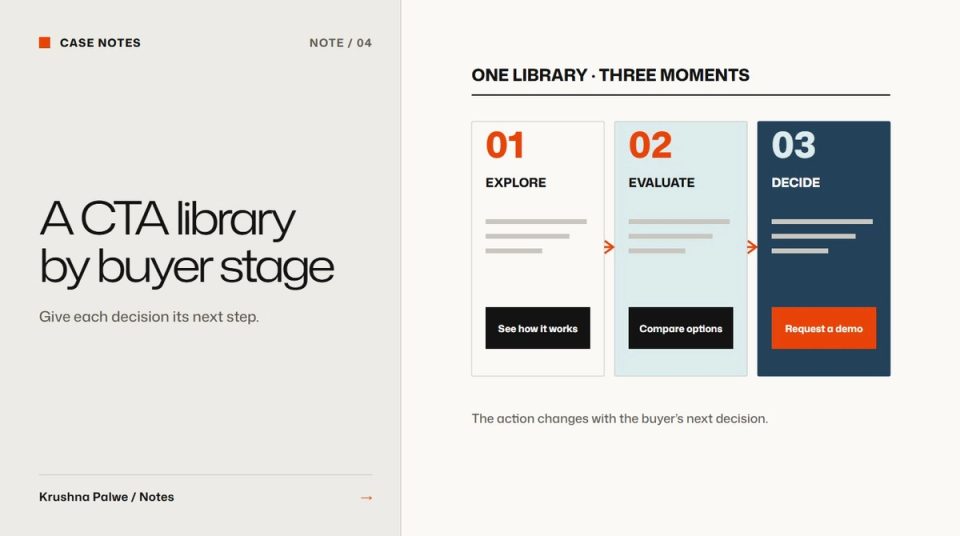
On many B2B websites every button says something slightly different. "Get started", "Request a demo", "Talk to us", "Book now", "Learn more", "Try it", all on the same page, all styled the same way. Visitors cannot tell which action matters, and the team cannot tell which one works. B2B CTA design improves quickly when calls to action are treated as a small, fixed library rather than invented page by page.
For the Datamotive website I wrote an eight-phrase CTA library, calibrated to buyer stage, as part of the brand language, so that every button could draw from one approved set. This note explains how to build one, and how the visual design supports it.
Map the stages your buyer actually goes through
Enterprise buyers rarely move from first visit to purchase in one session. A typical path has four stages:
- Orientation: working out what the product is and whether it is relevant.
- Evaluation: understanding how it works and whether it fits their environment.
- Validation: checking cost, proof and risk, often with colleagues.
- Commitment: talking to sales, starting a trial or a proof of concept.
Each stage needs a different action. Asking a first-time visitor to book a demo is like proposing on a first meeting. Asking a ready buyer to "learn more" wastes their intent.
Datamotive's buyers were a CIO or CTO, a cloud architect, an IT infrastructure manager, and a system-integrator partner. They move through the stages at different speeds, but the stages themselves are shared.
Write two phrases per stage
Two phrases per stage gives enough variety for different contexts while staying small enough to remember. The examples below are illustrative, not a copy of any client library:
- Orientation: "See how it works", "Explore the platform".
- Evaluation: "View the architecture", "Compare deployment options".
- Validation: "Estimate your costs", "Read the technical overview".
- Commitment: "Talk to an engineer", "Book a demo".
Rules for the phrases:
- Start with a verb that describes what happens next.
- Say what the visitor gets, not what the company wants.
- Avoid vague words like "submit", "click here" or "learn more" on their own.
- Keep them short enough to fit a button on a phone without wrapping.
Lock the library in the guidelines. New pages choose from it. A new phrase needs a reason, and if it is good, it replaces an old one rather than adding a ninth.
Match the action to the page
Each page has a dominant stage. A homepage is mostly orientation. A product page is evaluation. A pricing or cost page is validation. A contact page is commitment. Use the page's stage for the primary button, and the next stage for the secondary action.
Interactive tools can bridge stages. At Datamotive the TCO calculator lets a buyer validate cost on their own terms, and the detailed report becomes the step into commitment. I wrote about that in designing a TCO or ROI calculator.
Give buttons a clear visual hierarchy
The words decide what each action does. The design decides which one people see first.
- Primary: solid fill in the action colour, highest contrast. One per view.
- Secondary: outline or lower-contrast fill. Clearly a button, clearly less important.
- Tertiary: a text link with an arrow, for low-commitment paths.
Reserve the action colour for actions. If the same colour is used for decoration, headings or icons, the primary button stops standing out. BLANKSY's storefront uses a single action colour for the same reason.
Check contrast for text on the button and for the button against the page. A primary button that fails contrast is not primary for everyone.
Place actions where decisions happen
Put actions at the end of an argument, not in the middle of one. Good positions:
- After the hero's supporting line.
- After a section that answers a specific question.
- Next to proof, such as a diagram or a specification.
- At the end of the page, with the commitment action.
Do not repeat the same primary button in every section. Repetition trains people to ignore it. The general method for deciding what leads each view is in website visual hierarchy.
Design every state
Buttons are components, not pictures. Define and test default, hover, focus, active, disabled and loading states. The focus state matters most for accessibility, because keyboard users depend on it to know where they are. Build the states from tokens so they stay consistent across pages and products.
Keep words and visuals together in the system
The CTA library belongs in two places: the brand language guidelines, as phrases, and the component library, as button styles. When both are documented together, a new page gets the right words and the right weight without a review meeting. That is the same principle behind outcome-first messaging: language is part of the system, not decoration on top of it.
A CTA audit
- How many different CTA phrases does the site use? More than ten usually means no library.
- Does each page's primary action match its dominant stage?
- Is there one primary button per view?
- Is the action colour used only for actions?
- Are focus states visible on every button?
- Do the phrases fit on a phone without wrapping?
You can see the CTA library and the system around it in the Datamotive case study.