BLANKSY
Identity, guidelines and a live Shopify storefront for an Indian everyday-apparel label, from the aperture symbol to the product page.
1 master mark
5responsive logo assets

At a glance
BLANKSY is an Indian everyday-apparel label selling oversized tees, everyday tees and hoodies at blanksy.in. As a freelance designer in 2026, I led the brand strategy and concept, the identity (symbol, wordmark and five responsive logo assets), the colour, type and grid system, a 24-spread guideline, art direction, and the responsive storefront design. I directed the Shopify implementation using AI-assisted development workflows and reviewed the live build through QA. Product imagery on the store is concept imagery, and sample reviews are labelled as samples.
- Strategy & concept
- Audit of the store and 20 competing sites; the “Personal Aperture” concept
- Art direction
- Editorial and product direction, shown as labelled concept imagery
- Visual system
- Symbol, wordmark, 5 logo assets, colour and contrast, type, grid, guidelines
- Responsive design
- Homepage, collection and product pages, desktop and mobile
- Implementation & QA
- Directed with AI-assisted development on Shopify; reviewed with Theme Check and axe
Related services:Brand Identity Design Brand & Web Design
01 Problem
A good name with nothing holding it up.
BLANKSY had a name and a line — “Fill the Blank.” — and a storefront that undercut both. An audit of the existing store and twenty competing sites, ten Indian and ten international, found the gaps.
- Catalogue
- Fifteen product records describing four garments: duplicates, no tags, no product types, no colour options.
- Voice
- Product copy that read as machine-written, in a category where trust is the product.
- Navigation
- Gendered menus for garments that are cut for everyone.
- Category
- Indian essentials brands compete on “minimal”. Almost none publish the numbers a buyer needs.
02 Role
From identity to the live store.
I led the visual direction, brand application and storefront experience for BLANKSY, from identity and art direction through responsive e-commerce design.
I also directed the implementation using AI-assisted development workflows, defining the design system, interaction behaviour, responsive requirements and visual quality while continuously reviewing and refining the live build.
The current storefront includes concept product imagery and clearly labelled sample reviews. Those demonstrate the design experience; they are not customer evidence or sales results.
03 Thinking
A blank is not an empty thing.
“Blanks” is the apparel trade’s word for undecorated garments. The opening was to stop competing on minimalism and compete on specification: publish the weight, the measurements, the construction — every number, on every product.
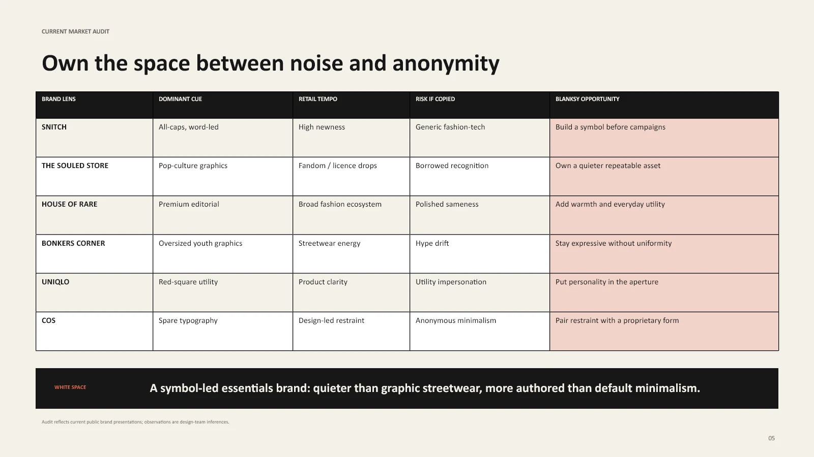
Blank space becomes the active part of the mark.


04 System
Change the asset, never the geometry.
One master symbol, drawn once, with five responsive assets cut from it for every size from a 16px favicon to a storefront header. The aperture is never bridged, closed or redrawn.


05 Application
On the garment, in the box, on the screen.


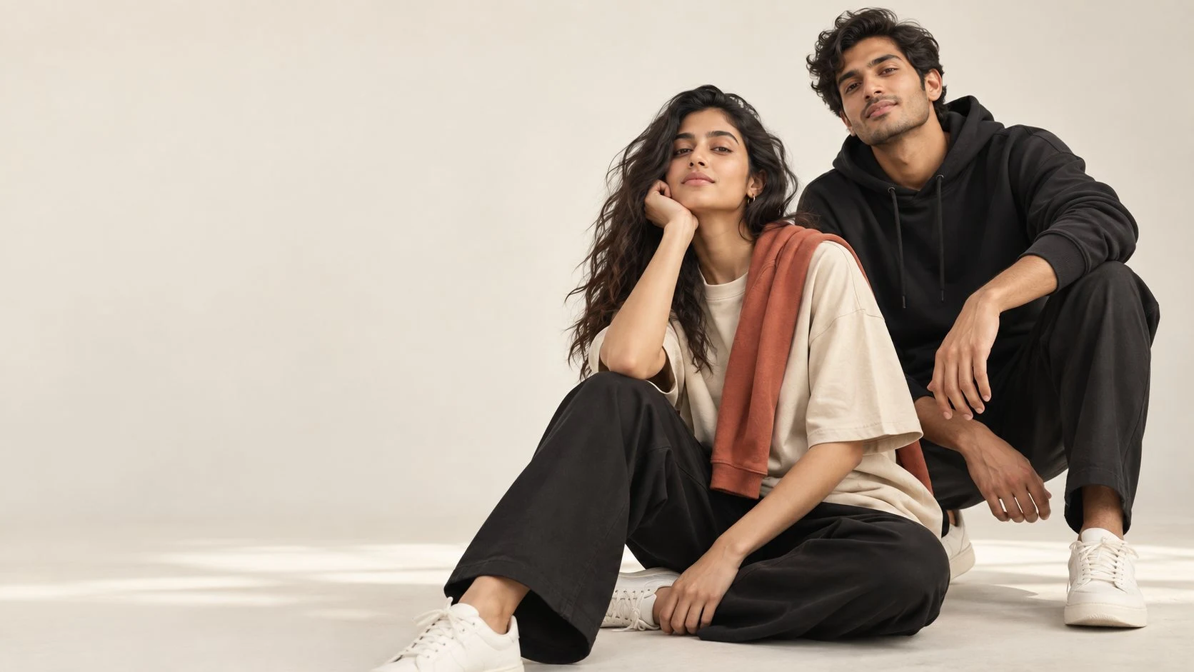
Application spreads use concept imagery and mockups for visualisation. Product facts on the live store come only from verified data.
Art direction · concept imagery
06 Storefront
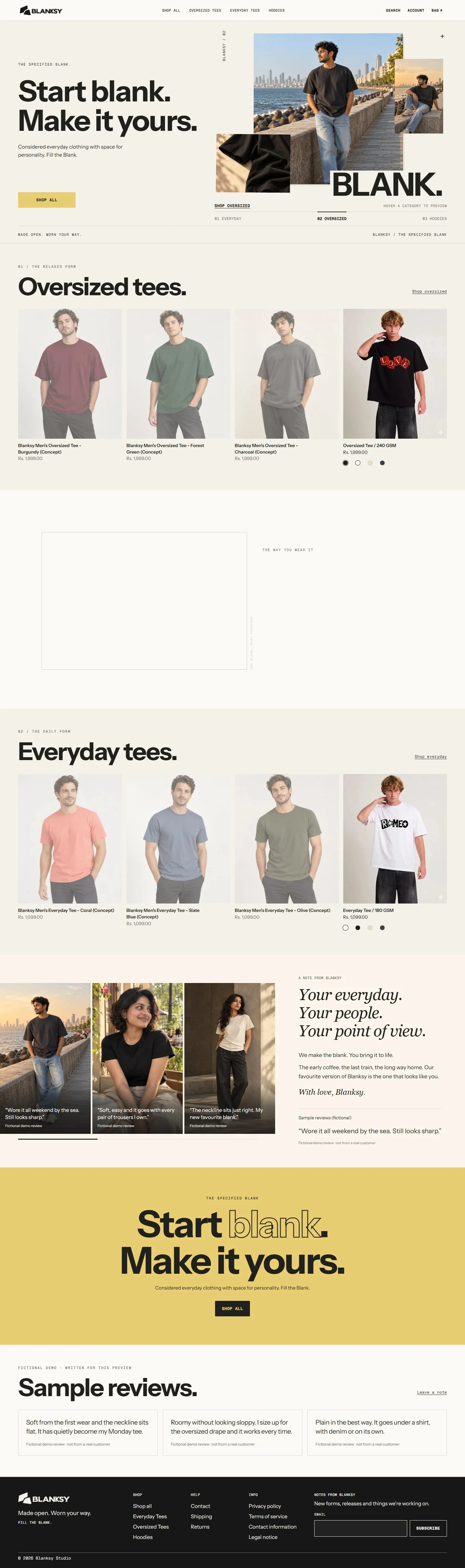
The live store: start blank, make it yours.
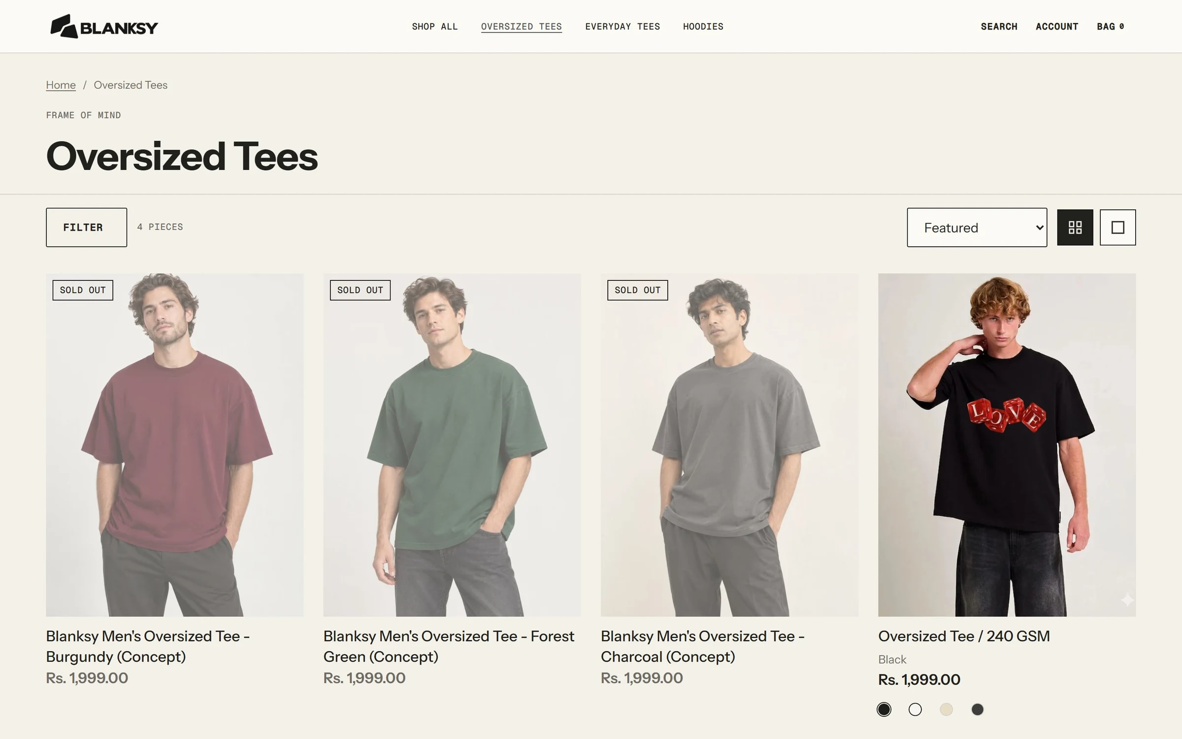
The current blanksy.in leads with the line “Start blank. Make it yours.” and routes straight into three categories: oversized tees, everyday tees and hoodies. The mark, heavy grotesque headlines and a single yellow action colour carry the identity into commerce.

Full homepage
Collection page
Product page
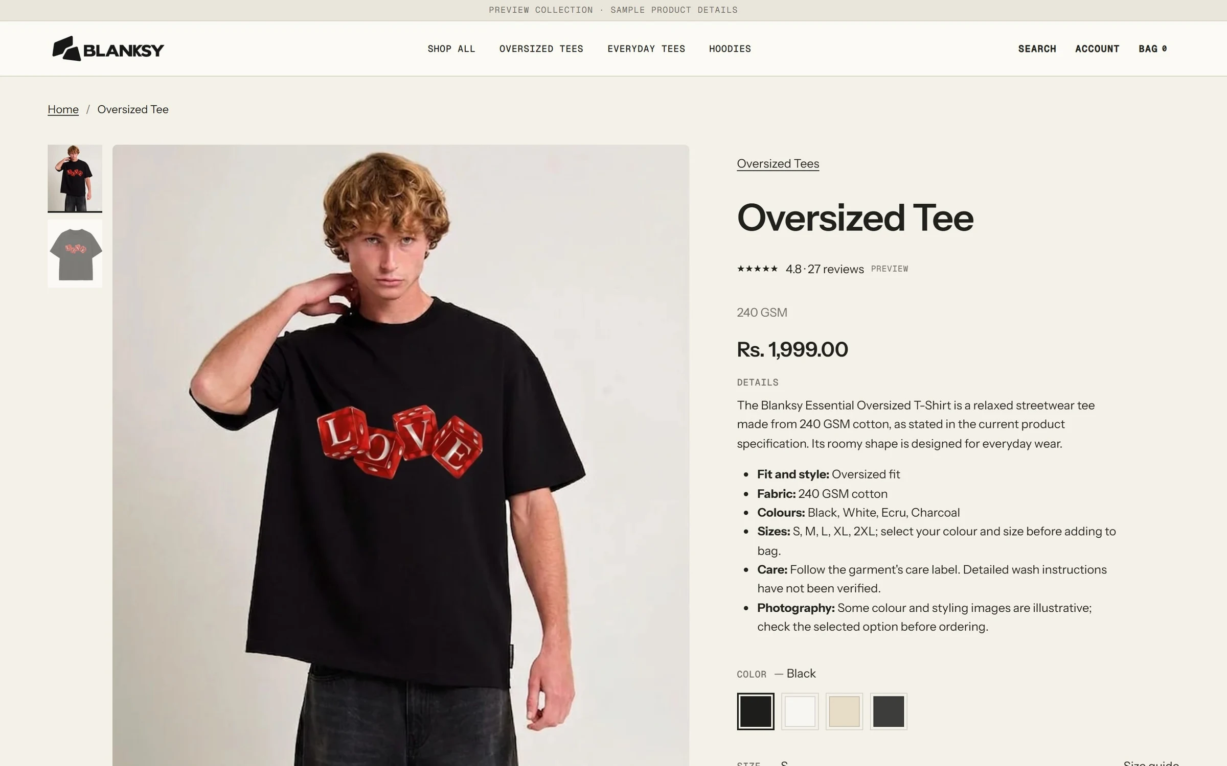


- Category-first
- Oversized, everyday and hoodies are the three routes in, from the hero switcher to the menu.
- Mobile as its own layout
- Stacked collage, a two-up product grid and a sticky purchase bar, not a shrunken desktop.
- Honest by design
- Concept products and sample reviews are labelled as such on the store itself.
07 Outcome
A brand that can say what it is.
- 1master symbolDrawn once. Never redrawn.
- 5responsive logo assetsFavicon to storefront header.
- 24guideline spreadsFoundation, identity, visual system, application, governance.
- 3apparel categoriesEveryday, oversized and hoodies.

Still open
Replace illustrative product imagery with the next commissioned shoot, and replace the labelled sample reviews with genuine customer feedback as it becomes available.