Mobile Product Page Design for Fashion: Purchase Controls That Stay in Reach
How to design a mobile fashion product page so options, price and the buy action stay in reach: content order, a sticky purchase bar, variant selection, and tap-safe details.
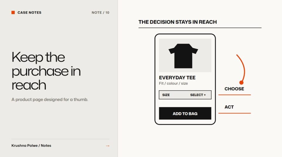
On a phone, a fashion product page is a long column. Images, title, price, colour, size, fit, description, care, delivery, reviews. Stack all of that in the desktop order and the buy button ends up somewhere between the second image and the delivery policy. Mobile product page design is mainly about one thing: keeping the decision and the action within reach while the shopper explores.
For BLANKSY, an everyday-apparel label I designed from identity to Shopify storefront, mobile was treated as its own layout rather than a shrunken desktop: a stacked collage on the homepage, a two-up product grid on collections, and a sticky purchase bar on product pages. This note focuses on that product page.
Decide the content order for a thumb
Write the mobile order as a list before designing it. A useful order for apparel:
- Images, swipeable, with a visible count or progress indicator.
- Name and price, together, immediately below.
- Colour, shown as swatches with the selected name in text.
- Size, with a one-line fit summary and the size guide link next to it.
- The purchase action.
- Key product facts: fabric, weight, fit, care, as short labelled lines.
- Delivery and returns in one or two lines, with a link for detail.
- Description, details and reviews, in collapsible sections.
The principle is that everything needed to decide comes before the action, and everything that supports the decision comes after it. Fit information on fashion product pages covers what belongs in step four.
Keep the action reachable with a sticky bar
Once a shopper scrolls past the purchase button to read details, the action is gone. A sticky purchase bar brings it back. Design choices that matter:
- Show it only after the main button leaves the screen. Two buy buttons on screen at once is confusing.
- Keep it compact: price, the selected options, and one button. No extra links.
- Reflect the current selection. If no size is selected, the bar's button should open the size choice rather than fail silently.
- Respect safe areas on phones with gesture bars, and make sure the bar never covers form fields or the cookie banner's controls.
- Use the single action colour of the identity, so the bar reads instantly as the place to act.
On BLANKSY the identity carries one action colour on a mostly monochrome system, which makes a sticky bar easy to spot without making it loud.
Make variant selection unambiguous
Most mobile purchase errors are variant errors: the wrong size or colour. Reduce them:
- Large tap targets for every size and swatch, with enough space between them.
- A visible selected state that does not rely on colour alone, such as a border plus a filled background.
- The selected colour name in text, because swatches are hard to distinguish on some screens.
- Unavailable options shown as unavailable, not hidden, so the shopper understands the range.
- Images that update when a colour is chosen.
Treat images as the first screen
The first screen on mobile is almost entirely image. Make it count:
- Use a consistent crop and scale across the catalogue so products feel comparable. Consistent ecommerce product photography covers that system.
- Let the shopper swipe without the page jumping, and support pinch zoom.
- Show the image count so people know there is more to see.
- Order images to answer questions, front, back, side, detail, styled, as described in fashion product page image sequence.
BLANKSY's concept products each have five views: front, back, side, a detail and a styling image, and the store labels them as AI-generated concept views. That honesty sits in the product description, close to the images.
Collapse the long content carefully
Collapsible sections keep the page manageable, but they hide content. Rules:
- Keep the most important facts outside the accordion, as short labelled lines.
- Use clear section names: "Fabric and care", "Delivery and returns", not "More info".
- Allow more than one section open at once.
- Make every accordion header a proper button with a visible focus state.
Check performance on a real phone
Mobile product pages are image-heavy. Serve responsive image sizes, lazy-load images after the first, and make sure the first image is not blocked by scripts. A slow first image on a mid-range phone undoes every layout decision above.
A mobile PDP review
On a real phone, one-handed:
- Can you see name, price and the first image without scrolling?
- Can you pick a colour and size without mis-tapping?
- Does the sticky bar appear only when needed and show the current selection?
- Is fit information next to the size choice?
- Are key facts visible without opening accordions?
- Does the page load its first image quickly on mobile data?
The layout decisions behind treating mobile as its own design are in restack or redesign. You can see the mobile product page, collection grid and sticky purchase bar in the BLANKSY case study.