Accessible Color Pairs: Give Every Combination a Measured Job
How to document accessible colour pairs: measure every foreground and background combination, assign each an approved job, and publish the rules with the tokens.
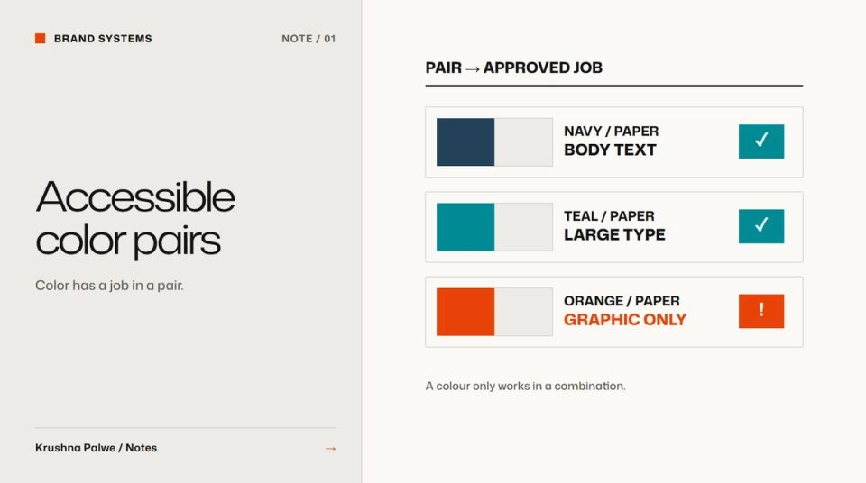
Brand palettes are usually documented as a row of swatches with hex values. That tells people what the colours are, not what they can do. The real accessibility risk is in combinations: teal text on white, white text on a mid-tone, grey captions on a beige surface. Documenting accessible color pairs means measuring each combination and giving it a job, so nobody has to guess.
I have documented colour this way on Datamotive, BLANKSY and this site. On BLANKSY the rule was written plainly: every colour pair has a measured ratio and an approved job. That sentence does more for accessibility than a page of general advice.
Why single swatches are not enough
Contrast is a property of two colours together. A teal can be perfectly accessible as a background for dark text and completely unusable as text on white. If the guidelines only list the teal, someone will eventually use it for text.
Datamotive's brand teal is a good example. It carries recognition, so it had to stay. Measured against white it is 2.24:1, well below what text needs. So its documented job is decorative only on light surfaces. A darker teal, teal-600, measures 3.47:1 on white and is approved for large text, icons and UI boundaries. Deep navy measures 10.65:1 on white and carries body text, diagrams and dark surfaces. Soft white on navy measures 9.84:1. The colour kept its place in the identity; its job was defined by measurement.
Measure the pairs people will actually use
List every surface colour in the system, then every colour that might sit on it: text, icons, borders, buttons. Measure each pair with a contrast checker. You do not need every theoretical combination, only the ones the system allows.
A practical pair table has these columns:
- Foreground token and value.
- Background token and value.
- Contrast ratio, to two decimal places.
- Approved job: body text, large text, UI component, decorative only.
- Not approved for: the most likely misuse.
Use the WCAG thresholds as the floor: 4.5:1 for normal text, 3:1 for large text and for essential UI boundaries such as input borders and focus indicators. Above the floor, decide brand rules. Many teams choose higher contrast than the minimum for body text, because readability on real screens in real light is worse than on a designer's monitor.
Assign jobs, not just pass or fail
Pass or fail tells people what they cannot do. A job tells them what to do instead. Typical jobs:
- Body text: the pairs for long reading.
- Secondary text: metadata, captions, labels. Still at least 4.5:1.
- Large text and icons: headings and graphical elements at 3:1 or more.
- Action: the button and link pairs, with hover and focus states measured as well.
- Decorative: graphics, illustration, diagram flows, never text.
This site follows the same pattern. The main ink is near-black on a paper tone. Two secondary inks are measured at 5.7:1 and 4.7:1 on the paper, so captions stay readable. The signal orange measures 3.35:1 and is reserved for graphic marks only. On the dark surface, the secondary ink is 7:1. The secondary and accent values sit in the stylesheet with their ratios in comments, so the rule travels with the token.
Keep the rule next to the token
Contrast documentation fails when it lives in a PDF nobody opens. Put the job beside the token wherever people work:
- In Figma, in the variable description.
- In CSS, as a comment beside the custom property.
- In the guidelines, as the pair table.
The broader naming rules for tokens are in design token naming, and the structure of a colour system in building a colour system that works across digital touchpoints.
Handle images and patterns
Text on photography and patterns is where measured pairs break down, because the background varies. Rules that work:
- Measure against the lightest and darkest areas the text will cover, not the average.
- Use a solid or translucent panel when the image is too varied.
- Prefer placing text beside images rather than on them for anything longer than a headline.
The same applies to brand patterns, covered in brand pattern design.
Check states and modes
Each interactive pair has states. A button that passes in its default state may fail on hover if the hover colour is lighter. Measure default, hover, focus and disabled. Disabled states are exempt from contrast minimums, but they still need to be recognisable as disabled rather than invisible.
If the site has a dark mode or dark sections, measure every pair again. A secondary grey that works on light paper rarely works on near-black.
A pair documentation checklist
- Is every allowed foreground and background combination measured?
- Does each pair have one approved job?
- Do decorative colours have an explicit "not for text" rule?
- Are action colours measured in every state?
- Are the rules visible beside the tokens in design and code?
- Has every pair been checked again for dark surfaces?
You can see the measured palette in the Datamotive case study and the pair rules in the BLANKSY identity.