Collection Page UX for Fashion Stores: Grid, Filters, and Merchandising
A practical collection-page framework for fashion ecommerce, covering product cards, filters, sorting, merchandising, mobile behavior, and visual consistency.
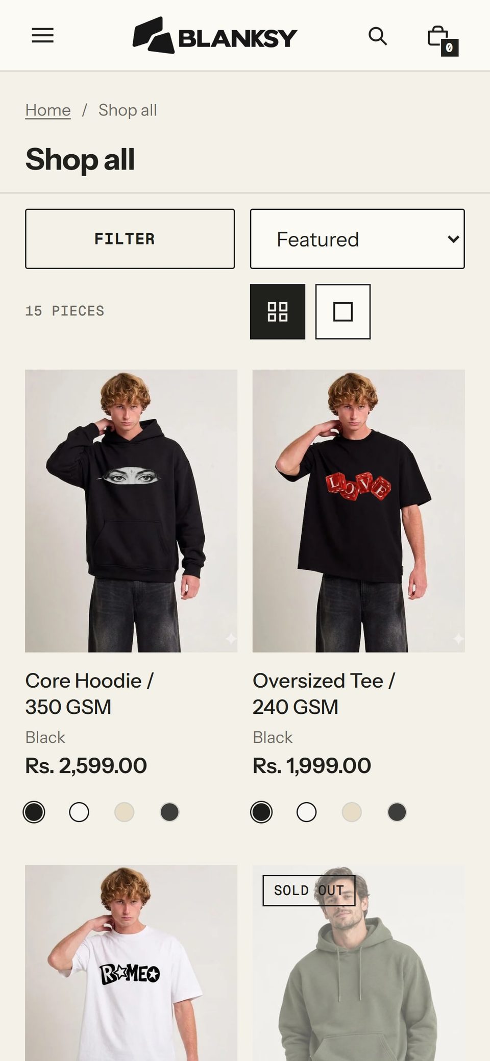
A fashion collection page is where a shopper compares products. The design has to make difference visible without making the grid noisy. Product cards, image crops, filters, sorting, badges, and merchandising all affect whether a visitor can find a product that feels worth opening.
Make the product card answer the first questions
At a glance, a shopper usually needs to know what the item is, how it looks, whether it is available, and what it costs. The card should not force a hover or a long tap to reveal the basics.
Use one dependable image ratio and one product scale across the grid. If the second image appears on hover, preserve a useful first image on touch devices. Keep the product name, price, and relevant variant information readable at the smallest grid width.
The image sequence described in fashion product page image design should be consistent with the first click. A collection card should not promise a view that the product page cannot support.
Let the catalog structure guide filters
Filters should reflect real shopper decisions, not every field in the product database. Product type, size, color, fit, material, and availability can be useful when the catalog supports them. A filter with one result or unclear labels creates more work than it saves.
Show active filters clearly, make them easy to remove, and preserve the user's position when the list updates. On mobile, a filter drawer should summarize the current state before it closes.
Shopify and Baymard offer useful baselines for ecommerce UX (opens in a new tab) and product-list usability (opens in a new tab). The visual designer's task is to apply those principles to the store's inventory, brand, and image system.
Use merchandising as a visible rule
Merchandising is not random product ordering. It can prioritize a new collection, a complete outfit, a best seller, a product with strong stock, or a seasonal edit. Make the logic understandable to the team maintaining the store.
Avoid visual badges that claim urgency without evidence. A small label is useful when it clarifies a real condition, such as new, low stock, or limited color. Too many labels flatten the hierarchy and make every product seem to shout.
Protect the rhythm of the grid
Grid rhythm comes from more than equal columns. It includes image ratio, card height, title line count, spacing, and the relationship between groups. A long product name should not make the row feel accidental. Set a predictable text treatment and decide whether the grid should align by image, card, or content.
BLANKSY uses a restrained identity, so the collection page has to create interest through product grouping, photography, and clear type rather than decorative noise. See the BLANKSY case study for the identity and storefront context.
Design the mobile path first
On mobile, two-column grids can make product images small while single-column grids increase scrolling. Test the catalog at the width where the product image and product name are still legible. Keep filter access visible without taking the whole viewport away from discovery.
Make sure the back button, scroll position, and active filters behave predictably after a product is opened. A shopper comparing two products should not lose the collection state each time.
A collection-page QA pass
- Can a first-time visitor understand the catalog categories?
- Are product cards comparable in scale and crop?
- Does each card expose the information needed before the click?
- Are filters based on real shopper decisions?
- Are active filters and sorting states visible?
- Does merchandising have a documented reason?
- Does the layout remain useful at mobile width and high zoom?
- Do collection images and product-page images tell the same truth?
The collection page is not a filler between the homepage and the product page. It is a decision surface. A good one makes comparison calm, keeps the brand recognizable, and helps the shopper reach the right PDP with fewer guesses.