Readable Body Text on the Web: Size, Measure, and Line Height
Practical settings for readable body text on websites: fluid size, line length, line height, weight, colour contrast, and spacing, with the values used on this site.
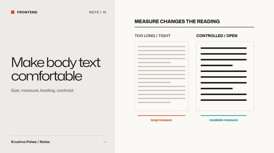
Designers spend hours on headlines and minutes on body text, yet body text is where people spend almost all their reading time. A long article, a product description or a case study succeeds or fails on whether the paragraphs are comfortable. Readable body text on the web comes down to a handful of settings that work together: size, measure, line height, weight, contrast and spacing.
These are the settings I use, with the actual values from the Notes pages on this site, which are set in Mona Sans.
Size: start larger than you think
Body text on the web is often set too small because it looks neat in a design file viewed at a distance. On real screens, at arm's length or on a phone, small text is tiring.
- General body text on this site scales from 16 to 18 pixels.
- Long-form article text in Notes scales from 17 to 19 pixels, because these pages are for sustained reading.
Both use CSS clamp(), so the size grows gently with the viewport instead of jumping at breakpoints. Use rem units so the text respects the reader's browser settings. If someone has set a larger default size, the page should honour it.
Measure: control the line length
Measure is the length of a line. Too long, and the eye struggles to find the start of the next line. Too short, and reading becomes choppy. A common target for body text is roughly 45 to 80 characters per line, with 60 to 75 being comfortable for most readers.
On this site, article text occupies six of the twelve grid columns on wide screens, which lands in that comfortable range on a typical laptop. Below 1100 pixels it spans the full content width, where the screen itself limits line length. If you are not using a grid, a max-width in ch units, such as 65ch, is a simple way to cap the measure.
Line height: more for longer lines
Line height, or leading, gives each line room. Longer lines and larger x-heights need more.
- Interface and general body text on this site uses a line height of 1.55.
- Article text uses 1.65, because the lines are longer and the reading is longer.
Headings use much tighter line heights, often below 1.1, because they are short and large. Applying body line height to headings makes them fall apart. The two need separate settings, which is why type roles are useful. See how to build a brand typography system.
Weight and tracking: small adjustments matter
Variable fonts let you fine-tune weight. This site sets body text at weight 420 rather than a standard 400, which gives slightly more presence on lighter screens without looking bold. Letter spacing for body is almost neutral, a fraction tighter than default.
Avoid light weights for body text. They can look elegant in a mockup and become hard to read on lower-quality screens or in bright light. Variable fonts in brand systems covers how weight and width settings are defined as roles.
Contrast: readable is not the same as compliant
Body text should comfortably exceed the 4.5:1 WCAG minimum. Near-black on an off-white or warm paper tone usually reads better than pure black on pure white, which can feel harsh over long passages, but keep the contrast high.
Secondary text, such as captions and metadata, still needs to meet 4.5:1. On this site the secondary inks measure 5.7:1 and 4.7:1 against the page. Making secondary text pale enough to look subtle often makes it unreadable for many people. Accessible colour pairs explains how to document which combinations are allowed.
Paragraph spacing and structure
Space between paragraphs should be clearly larger than the space between lines, so paragraphs read as units. Avoid indenting and spacing at the same time.
Structure helps readability as much as typography:
- Use short paragraphs, especially on mobile.
- Add subheadings every few paragraphs in long articles.
- Use lists for steps and parallel items.
- Keep links visibly underlined or clearly distinct, not just a slightly different colour.
Respect user settings
Readers adjust text in ways designers should support:
- Browser zoom and default font size, which
remunits respect. - Increased letter, word and line spacing for readability. WCAG asks that content still works when users increase these, so avoid fixed heights on text containers.
- Dark mode, where body text contrast needs checking again.
Test with real content
Lorem ipsum hides problems. Test body settings with a real long article, on a phone, a laptop and a large monitor, in daylight and at night. Read a full page yourself. If you find yourself skimming, the settings are probably working against you.
A readability checklist
- Is body text at least 16 pixels, and larger for long reading?
- Is the line length roughly 45 to 80 characters, ideally around 65?
- Is line height around 1.5 or more for body text, tighter for headings?
- Is the weight comfortable, not light?
- Do body and secondary text both exceed 4.5:1?
- Does the layout survive increased text spacing and zoom?
The same reading settings apply to case studies, which recruiters often read on phones. How to structure a design portfolio case study covers the layout around them. You can also see how the type system reads across long pages in the about page.