Fix the Shopify Catalog Before the Redesign
Why a Shopify redesign should start with the catalog: audit duplicates, product types, tags, options and metafields so navigation, filters and product pages have data to work with.
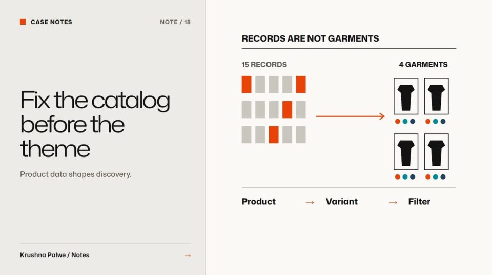
Store redesigns usually start with the homepage. The theme gets chosen, the hero gets designed, and only later does someone notice that the filters do not work because half the products have no type, the colour swatches cannot appear because colours were never set up as options, and the same t-shirt exists four times. A redesign is only as good as the data underneath it. Shopify product catalog structure is the first thing I look at.
When I started on BLANKSY, an Indian everyday-apparel label, the audit of the existing store found fifteen product records describing four garments: duplicates, no tags, no product types, and no colour options. No amount of visual design could have made that store easy to browse. This note covers the audit I now run before any storefront design.
1. Count garments, not records
Export the catalog and group records by the actual physical product. Ask: how many distinct garments does this business sell? Then compare with how many product records exist.
A big gap usually means one of these:
- Duplicates created when products were re-uploaded instead of edited.
- Colours as separate products when they could be variants, or the reverse.
- Test or draft products left visible.
- Old products that are no longer sold but still published.
Decide what each garment should be in Shopify before touching the theme.
2. Decide products versus variants deliberately
Shopify lets you model colour as a variant option within one product, or as separate products. Both are valid:
- One product with colour variants keeps reviews, description and SEO in one place, and lets the product page switch images by colour.
- Separate products per colour let each colour appear as its own card in collections and have its own URL, which some fashion stores prefer for browsing.
The mistake is not choosing either. It is mixing both without a rule. Write the rule down: for example, colour as separate products, size as variants. Then apply it to every garment.
3. Give every product a type
Product type is one of the simplest and most useful fields. It powers automated collections, filters and reporting. Use a short fixed list that matches how shoppers think about the range. BLANKSY's store routes shoppers through three categories, oversized tees, everyday tees and hoodies, and product types follow a similarly small, plain vocabulary.
Avoid encoding several facts in one type, such as "Women Oversized Tee Cotton". Use the type for what the product is, and other fields for the rest.
4. Use tags for rules, not for everything
Tags are flexible, which is why they become messy. Use them for things that drive behaviour:
- Membership in automated collections.
- Labels the theme reads, such as "new" or "concept".
- Exclusions, such as products hidden from search.
BLANKSY's current concept products carry tags that mark them as concept items with AI-generated images. That lets the theme and any future filters treat them differently from released products, from a single source of truth.
Keep a written list of approved tags. Unlisted tags tend to multiply with spelling variations.
5. Move specifications into metafields
Fabric, weight, fit, measurements and care instructions should not live only inside the description text. Store them as metafields so the theme can show them consistently, as short labelled lines on the product page, as filter values on collections, and in size guides.
For apparel, a useful starter set:
- Fabric composition and weight.
- Fit (relaxed, regular, oversized).
- Garment measurements per size.
- Care instructions.
- Country of manufacture.
If values are not confirmed yet, leave the field empty and let the template show a clear "awaiting confirmation" state rather than inventing values. Fit information on fashion product pages covers how that information should appear.
6. Clean the navigation labels
Navigation should follow how the garments are cut and worn, not internal habits. BLANKSY's original store had gendered menus for garments cut for everyone, which forced shoppers into a choice that did not match the product. Check every menu label against the catalog: does each one lead to a real, well-populated collection?
7. Fix the copy last, but fix it
Product descriptions that read as machine-written undermine trust, especially in a category where trust is the product. The audit at BLANKSY flagged exactly that. Once the structure is clean, rewrite descriptions to a template: one line on what the garment is, the fit, the key facts from metafields, and care. Short and specific beats long and generic.
Why this comes before design
Once the catalog is structured, design decisions get easier and better:
- Collection pages can offer real filters. See collection page UX for fashion stores.
- Product pages can show consistent facts beside the purchase action. See mobile product page design for fashion.
- The homepage can route into categories that actually exist. See Shopify fashion homepage design.
A catalog audit checklist
- How many garments, and how many records?
- Is there a written rule for products versus variants?
- Does every product have a type from a fixed list?
- Is there an approved tag list?
- Are specifications in metafields, not only in descriptions?
- Do navigation labels match real collections?
- Are concept or unreleased products clearly marked?
You can see the audit findings, the three-category structure and the live store in the BLANKSY case study.