Shopify Fashion Homepage Design: A Section-by-Section Framework
A visual and information framework for a Shopify fashion homepage, from collection introduction and product discovery to proof and purchase intent.
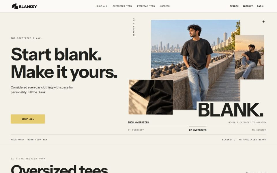
A fashion homepage has two jobs that can pull in opposite directions. It must express why the brand is worth remembering, and it must help a shopper find something worth buying. A strong Shopify homepage treats those jobs as a sequence rather than forcing every message into the first screen.
1. Establish the current reason to look
The hero should answer what is happening now: a new collection, a signature product, a seasonal story, or a clear brand promise. Keep the message specific enough that a visitor knows where to go next.
The image should show the product or the world around it, but not at the cost of recognition. A campaign image that hides the product can work as editorial context lower on the page. The first screen usually needs a readable silhouette, a clear contrast between type and image, and one primary action.
2. Move quickly to discovery
Do not make the visitor reconstruct the catalog from a brand story. Follow the hero with a useful path into collections, bestsellers, or a small set of product categories. The labels should match the way shoppers think, not the internal structure of the inventory.
For a small catalog, a focused collection grid can be more helpful than a complex mega-menu. For a large catalog, show the most important categories and let the navigation carry the depth. The page should not repeat every navigation link in a longer form.
3. Let the product system do the selling
Use a product section to show the catalog's visual consistency: card ratio, product scale, color naming, price, and availability. If hover or motion adds a second view, ensure the first view remains useful on touch devices.
The image rules described in fashion product page image sequence should begin at the homepage. A shopper should not feel that product truth changes after the click.
4. Add one layer of brand context
Brand story is most useful when it explains a product choice or a point of difference. Talk about material, making, fit, or a design decision that helps a shopper decide. Avoid an abstract mission paragraph that could belong to any apparel store.
BLANKSY uses a responsive identity and a storefront system where the quiet visual character gives the products room to speak. The BLANKSY case study shows how the identity, product presentation, and Shopify surface were considered together.
5. Place proof where doubt appears
Proof can be reviews, material details, shipping clarity, size help, user photography, or a transparent returns explanation. Do not place every proof signal in one testimonial block. Put the answer close to the question it resolves.
If a visitor is choosing a product, show fit, material, and care information near product discovery. If they are evaluating the brand, show the story and collection logic. If they are deciding whether to trust the store, make service information easy to find.
6. End with a deliberate next step
The lower homepage should not become an archive of every asset. Choose a next step: explore the full collection, read the brand story, join a mailing list, or see a seasonal edit. Keep the action consistent with the visitor's likely stage.
A homepage review scorecard
Review the page at mobile width first, then desktop:
- Can a first-time visitor name the current offer or story?
- Is the first product path visible without hunting?
- Does each section do a different job?
- Are the same crop and scale rules used across collection and product images?
- Do the type scale and spacing create clear section rhythm?
- Are proof and service details discoverable before checkout anxiety peaks?
- Does the final CTA lead to a meaningful next step?
Shopify's own homepage guidance (opens in a new tab) and ecommerce UX guidance (opens in a new tab) are useful baselines. The designer's value is applying them to the brand, catalog size, and evidence available.
For the next layer, read collection page UX for fashion stores and how to keep ecommerce product photography consistent.