Website Section Rhythm: Spacing, Tone, and Pace on Long Pages
How to design section rhythm on long web pages: two or three section spacings, tonal surfaces instead of borders, alternating density, and a pace that matches the argument.
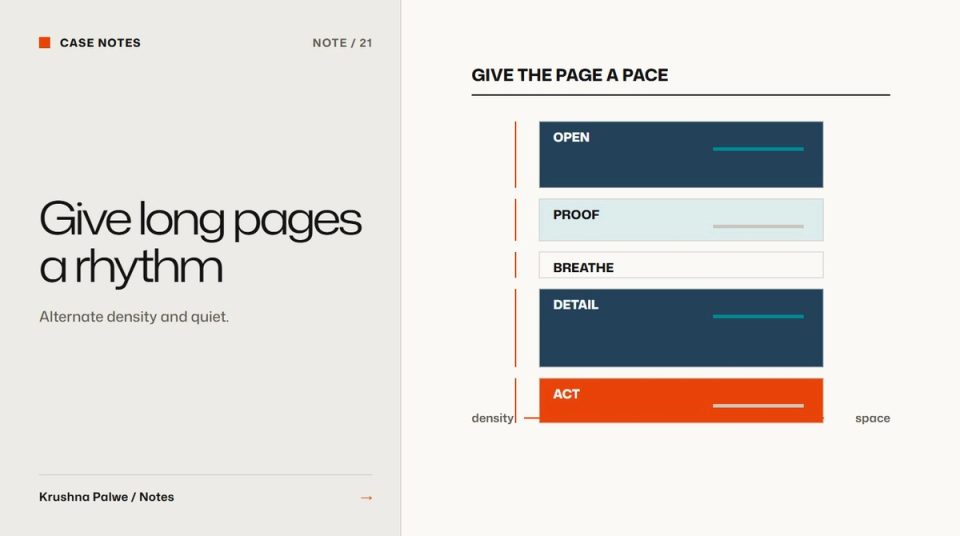
Long marketing pages have a pace, whether anyone designed it or not. When every section has the same padding, the same background and the same density, the page reads as one long grey corridor. When every section has a different treatment, it reads as a scrapbook. Website section rhythm is the set of decisions that makes a long page feel like a sequence: where it breathes, where it speeds up, and where it signals a change of subject.
I think about rhythm on every long page, including this site and the Datamotive website, where the system was built around a principle called Architectural Fluidity: sections separated by tone, spacing and hierarchy rather than heavy borders.
Fix two or three section spacings
Most pages need only a few vertical spacing values between sections:
- A standard section gap for moving between topics.
- A smaller gap for closely related sections, such as a statement followed by its evidence.
- Optionally, a larger break for a major change, such as moving from the product story to proof.
On this site those are tokens. The standard section spacing scales fluidly from 88 pixels on a phone to 184 on a wide screen, and the smaller one from 56 to 112. Inside sections, a fixed scale of 4, 8, 12, 16, 24, 32, 48, 64 and 96 pixels handles everything else. Because the values are named, a new section has no reason to invent its own padding. I covered the scale itself in a spacing system for websites.
The point of fixing these values is not tidiness. It is meaning. When a gap is larger than usual, the reader should feel that something new is starting.
Separate with tone before lines
Borders and boxes are the quickest way to separate sections and the quickest way to make a page feel heavy. Tonal surfaces do the same job more quietly:
- A light page surface for most content.
- A slightly sunken tone for supporting sections, such as specifications or FAQs.
- A dark surface, used rarely, for a moment of emphasis.
This site uses three surfaces of that kind, a paper tone, a slightly darker sunk tone and a near-black night tone, each with its own text colours that keep contrast. At Datamotive, deep navy and soft white played similar roles. With fewer lines on the page, the remaining rules and dividers carry more meaning.
Do not alternate backgrounds mechanically, light, dark, light, dark. Change tone when the content changes role, not every time a section ends.
Alternate density
Sections also differ in how much they contain. A useful pattern alternates:
- Open sections: one statement, lots of space, a single image or diagram.
- Dense sections: grids of features, specifications, logos, comparisons.
Two dense sections in a row tire the reader. Two open sections in a row feel slow. Placing a short open statement between dense sections gives the reader a moment to absorb what came before.
Match pace to the argument
The order of sections is an argument. A typical B2B page moves from promise to explanation to proof to action. Rhythm should follow:
- The opening can be generous, because it sets the tone.
- The explanation can be denser, because interested readers are now committed.
- Proof benefits from a change of surface, so it reads as evidence rather than more claims.
- The close should be calm and focused on one action.
Outcome-first messaging covers how to structure the argument itself. Rhythm makes that structure visible.
Keep internal spacing consistent
Rhythm between sections only works if spacing inside sections is predictable. Define the gap between a section label and its heading, between a heading and its body, and between body and an image. Headings should sit closer to their content than to the section above, so they belong to what follows. This is the same grouping rule described in website visual hierarchy.
Check rhythm on a phone
Rhythm changes on small screens. Side-by-side layouts become stacks, so a section that was short on desktop can become very long on mobile. Fluid section spacing helps, because large desktop gaps shrink in proportion rather than leaving huge empty areas on a phone. Also check that tonal changes are still visible on small, bright screens, where subtle differences can disappear. Restack or redesign covers how to decide when a stacked layout needs its own design.
A rhythm review
Scroll the whole page quickly, then answer:
- Can you tell where one topic ends and the next begins without reading?
- Are there more than three different section gaps in use?
- Are any two dense sections next to each other?
- Does tone change for a reason, or by alternation?
- Is the closing section calmer than the middle of the page?
- Does the rhythm survive on a phone?
A long page with good rhythm feels shorter than it is. The reader always knows roughly where they are and what kind of section comes next.
You can see tone-based sections across product pages in the Datamotive case study, and the same approach throughout the work index of this site.