Fit Information on Fashion Product Pages: Size Guides That Reduce Doubt
How to design fit information and size guides for fashion product pages: garment measurements, fit descriptors, model references, placement, and honest handling of missing data.
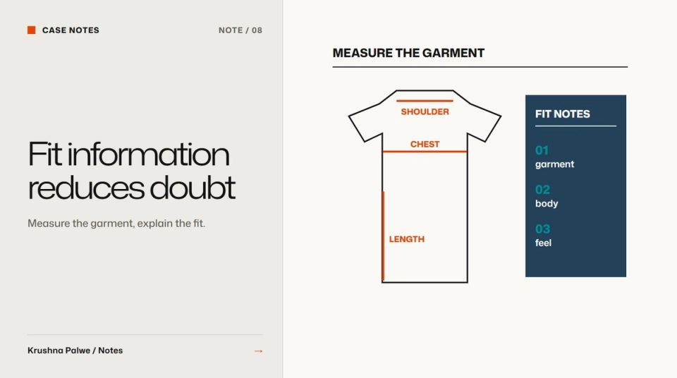
Online, a shopper cannot try anything on. Every sizing doubt becomes either an abandoned cart or a return. Product photography answers what the garment looks like. Fit information answers the harder question: will it fit me? Good fashion size guide design treats that question as part of the product page, not as a chart hidden behind a link.
Two projects shaped how I think about it. For BLANKSY, an Indian everyday-apparel label, the identity's central idea was to compete on specification rather than minimalism: publish the weight, the measurements and the construction, every number, on every product. For Collect Present, a hat brand on Amazon US, one of seven fixed listing slots was a size guide covering circumference, brim and fit, because on a marketplace a sizing doubt becomes a return.
Publish garment measurements, not just body sizes
Most size charts list body measurements: chest, waist, hips for each size. Those help a shopper choose a size, but they do not describe the garment. Two tees both labelled "M" can fit very differently.
Garment measurements describe the product itself:
- Chest width measured flat, armpit to armpit.
- Body length from the highest point of the shoulder.
- Shoulder width and sleeve length.
- For bottoms: waist, rise, inseam, leg opening.
- For hats: head circumference and brim width.
Show how each is measured with a simple line diagram on a flat garment. A shopper can then compare with a favourite garment they already own, which is often the most reliable fitting method available online.
Describe the fit in words too
Numbers need interpretation. Add a short fit description:
- Intended fit: relaxed, regular, oversized, shaped.
- How it compares: "cut longer in the body than our everyday tee".
- Sizing advice: "true to size", or "size down for a closer fit".
BLANKSY's catalogue separates oversized tees, everyday tees and hoodies as three routes into the store, and that split is partly a fit decision. The category tells a shopper what kind of fit to expect before they open a product.
Add a person reference
A photograph on a model helps when the page states the model's height and the size worn. "Model is 180 cm and wears M" lets a shopper scale the image to their own body. Without that sentence, the photo shows styling but not fit. Fashion product page image sequence covers where a worn shot belongs in the sequence.
Place fit information next to the decision
The size guide link usually sits under the size selector in small grey text, and many shoppers never open it. Fit information works better when it appears where the decision is made:
- A one-line fit summary directly above or beside the size options.
- Key measurements for the selected size visible without opening a modal.
- The full chart in a panel or drawer, not a separate page, so shoppers keep their place.
On mobile, keep the size selector and the fit summary together near the purchase action. Mobile product page design for fashion covers how to keep that cluster within reach.
Handle missing data honestly
Sometimes measurements are not available yet. A brand might be presenting concept products before production, or waiting for final samples. The temptation is to fill the gap with generic measurements from a supplier sheet or a competitor. Do not.
BLANKSY's current storefront shows this in practice. Its concept products state that fabric and weight, measurements, available sizes and care instructions are awaiting confirmation, and that the final garment may differ. It is less polished than a full chart, but it is true, and it keeps the store's central promise intact: when numbers appear, they are real. I wrote more about that kind of honesty in labelling AI-generated imagery.
Design the template so the missing-data state looks deliberate: the same layout, with a clear statement in place of the values, rather than an empty table.
Keep the size guide consistent across the catalogue
Fit information is only useful if it is consistent:
- Measure every garment the same way, with the same points.
- Use the same units everywhere, and offer a unit switch if selling internationally.
- Keep fit descriptors to a fixed vocabulary.
- Store measurements as structured product data, not as images of tables, so they can be shown on product pages, filtered on collection pages and read by screen readers.
Structured data matters on Shopify in particular. Measurements held in product metafields can feed the product page, the collection filters and the size guide from one source. Fix the Shopify catalog before the redesign covers the data side.
Make the chart accessible
Size charts are often images or wide tables that break on phones. Better:
- A real HTML table with header cells, so screen readers can navigate it.
- A layout that shows one size at a time on narrow screens, or lets the table scroll horizontally with a visible cue.
- Enough contrast and type size to read the numbers easily.
A fit information checklist
- Are garment measurements shown, not just body measurements?
- Is there a diagram of how each measurement is taken?
- Is there a short fit description and sizing advice?
- Does the worn image state the model's height and size?
- Is fit information visible beside the size selector?
- Is missing data stated honestly, in a designed state?
- Is the data structured and consistent across the catalogue?
You can see the specification-first idea behind the identity in the BLANKSY case study, and the size guide slot in the seven-slot listing system for Collect Present.