B2B SaaS Brand Design
For B2B SaaS and technology companies whose brand grew product by product: the logo still works, but the website, decks, product pages and diagrams no longer look like one company. I refine the identity, set the rules for how each product sits under the master brand, and document the system so your team can keep using it.
By Krushna Palwe, senior visual designer. Best suited to B2B SaaS, technology and brand-system projects. Based in Pune, Maharashtra. Available for remote projects with teams in Pune, Mumbai and Bengaluru (Bangalore).
01 / Problems
When this is the right project.
- Your products look like they come from different companies.
- Buyers can’t tell quickly what you do, or why they should trust it.
- Enterprise prospects read visual inconsistency as operational risk.
- The brand lives in one designer’s head, or in a PDF nobody opens.
- Marketing ships decks, campaigns and events every week with no shared rules.
02 / Included
What’s included.
- Brand audit
- Website, sales decks, product pages, diagrams and competitors, read for where the brand breaks.
- Identity refinement
- Logo usage, colour, type and the meaning of the core motif, written down so it can extend without drift.
- Brand architecture
- How the master brand and each product identity relate: what is shared, and the few things that flex.
- Foundations
- Colour, type, spacing and elevation as named values (design tokens) that design and development share.
- Brand language
- Outcome-first messaging and a fixed CTA library, so the words stay as consistent as the visuals.
- Applications
- Website, sales decks, social and print rebuilt on the foundations, not just described in a guideline.
Scope boundary: Visual identity and brand architecture; naming and market research are separate. Agree the application list before work starts.
03 / Process
How the work runs.
Stages overlap on real projects. They’re the order decisions get made in, not a rigid schedule.
- 01
Audit
Read what exists and where it contradicts itself, from the homepage to the architecture diagrams.
- 02
Brief
A written brief with the goal, the buyers, the constraints and what “done” means, before any visual.
- 03
Direction
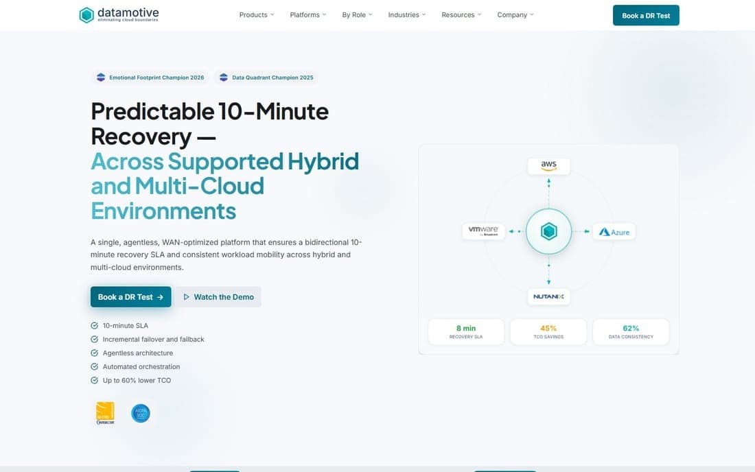
Decide what to keep. At Datamotive the hexagon, cube and teal already carried recognition, so the brief was to evolve, not replace.
- 04
Foundations
Named values for colour, type and spacing first; components and pages come after.
- 05
Application
The website, decks and product pages rebuilt on the system, so it’s tested on real work.
- 06
Handoff
Guidelines written for the people who will use them, including developers.
04 / Relevant work
The evidence.


05 / Proof
Shipped, and checkable.
At Datamotive, three product identities (EasyMigrate, EasyHybridDR and EasyProtect) share one token system with the corporate brand.
Datamotive case studyThe Datamotive rebrand covers the visual identity, design tokens, component guidelines and brand documentation, applied across web, marketing and sales.
Datamotive case studyThe rebuilt Datamotive website is live at datamotive.io.
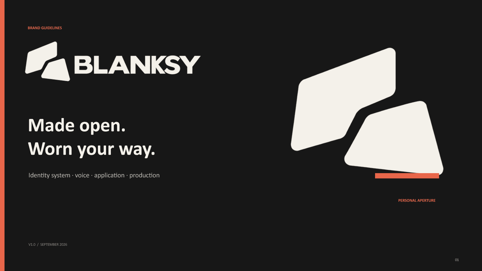
Datamotive case studyBLANKSY’s identity is built from one master symbol, cut into five responsive logo assets, and documented in 24 guideline spreads.
BLANKSY case study
06 / Questions
Asked before starting.
Do you redesign the logo?
Only when the logo is the problem. Often the mark already carries recognition; at Datamotive the brief was to strengthen the existing hexagon, cube and teal, not replace them. The audit decides.
How do product brands relate to the master brand?
Each product shares the grid, the type ramp and the components. Only a few parameters flex, such as primary colour, tone and information density, so a new product joins by setting values rather than starting over.
Can you work with our product team and developers?
Yes. Foundations are defined as design tokens that designers and developers share, and I can review or build the frontend myself.
Is this a brand strategy engagement?
It includes the strategy a visual system needs: positioning, buyers, tone and messaging priorities. It isn’t a naming or market-research engagement.
Do you work remotely?
Yes. I’m based in Pune, India (IST) and available for remote collaboration.
Related notes
Discuss your SaaS brand.
Share your product family, buyers and where the brand currently loses consistency. Share what you know; missing inputs can be discussed together.
Best suited to B2B SaaS, technology and brand-system projects. Based in Pune, Maharashtra. Available for remote projects with teams in Pune, Mumbai and Bengaluru (Bangalore).