Restack or Redesign: Responsive Layout Decisions for Marketing Sites
When a responsive layout can simply restack on mobile and when it needs its own design, using two real projects: a SaaS website and a fashion storefront.
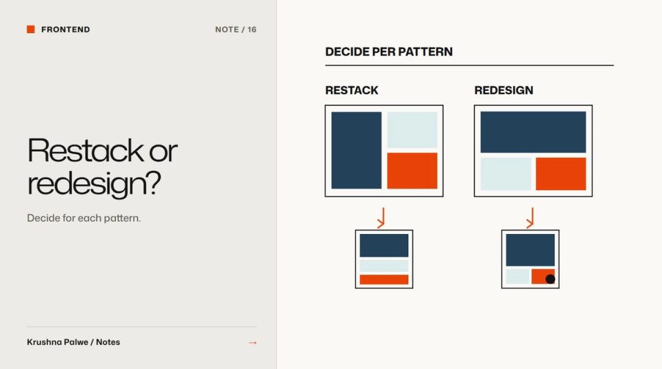
Every responsive project eventually hits the same question. Do we design a separate mobile version of this page, or does the desktop layout just stack? Both answers are right somewhere. Responsive layout design gets easier when the decision is made per pattern, with a clear test, rather than as a single policy for the whole site.
Two of my projects landed on opposite sides of that question. The Datamotive website had no separate mobile design pass: the same tokens and hierarchy restack, navigation collapses to one control, and the type ramp holds. The BLANKSY storefront treated mobile as its own layout: a stacked collage, a two-up product grid and a sticky purchase bar, rather than a shrunken desktop. Both were deliberate.
When restacking is enough
Restacking works when the content already has a clear linear order and the system is strong enough to carry it. Signs that a pattern can simply restack:
- The content is an argument read in sequence. Headline, explanation, proof, action. A B2B marketing page is mostly this.
- The type ramp is fluid. Sizes that scale between a minimum and maximum keep hierarchy intact at every width.
- Spacing is tokenised. Section and component spacing shrink in proportion rather than breaking.
- Images are explanatory, not navigational. A diagram can sit below its text without losing meaning.
Datamotive fits that description. The product story reads top to bottom, the diagrams follow the text they explain, and the token system meant the layout could reflow without a second design. The case study shows the homepage at 480 pixels to prove it.
Restacking still needs decisions. Choose the stack order on purpose: does the image come before or after the text? Usually the text comes first if it carries the argument, the image first if it is the product.
When mobile needs its own design
A separate mobile design is worth it when the mobile task differs from the desktop task, or when simple stacking would bury the most important action. Signs:
- The page is navigational, like a collection grid, where scanning many items matters more than reading.
- The key action would scroll away, as on a product page with long images and details.
- Side-by-side comparison carries meaning, and stacking would turn a comparison into two unrelated blocks.
- Most traffic is mobile and transactional, which describes much of fashion ecommerce.
BLANKSY fits that description. A shopper on a phone needs to scan products quickly, see the garment large, and keep the purchase action within reach. So the mobile collection uses a two-up grid, the homepage uses a stacked collage rather than a shrunken desktop hero, and product pages keep a sticky purchase bar. Those choices are covered in mobile product page design for fashion and collection page UX for fashion stores.
A test for each pattern
For each major pattern, a hero, a feature grid, a comparison, a product page, a navigation menu, ask:
- What is the user trying to do on a phone here? Read, scan, compare, buy, or find?
- Does stacking preserve that task? If the task is reading, usually yes. If it is comparing or buying, often no.
- Where does the primary action end up after stacking? If it falls below a long image sequence, redesign.
- Does the hierarchy still hold? Run the squint test from website visual hierarchy at 375 pixels.
The answers usually split a site into a few redesigned patterns and many restacked ones. That is a much smaller job than designing every page twice.
Build the system so restacking is safe
Restacking only works if the system is designed for it:
- Fluid type roles with sensible minimums, so headlines do not overflow and body text stays readable.
- Spacing tokens that scale with the viewport.
- Components that adapt internally, such as cards that change from horizontal to vertical without a separate component.
- Navigation that collapses predictably, ideally to one control.
- Images with defined crops for narrow layouts, so the subject stays visible.
The underlying scale is in a spacing system for websites.
Design mobile-specific patterns as components
When a pattern does need its own mobile design, build it as a variant of the same component, not as a separate page. BLANKSY's sticky purchase bar is a mobile behaviour of the product form, using the same tokens, colours and type. That keeps the identity consistent and the codebase small.
Test on real widths
Check at least 320, 375, 414, 768 and 1024 pixels, and on a real phone. Look for:
- Text that wraps awkwardly, especially buttons and headlines.
- Images that crop out their subject.
- Actions that drift below long content.
- Tap targets that are too small or too close together.
- Sticky elements that cover content or each other.
A responsive layout is only finished when it holds at the narrowest width people actually use.
You can see a restacked SaaS site in the Datamotive case study and a mobile-specific storefront in BLANKSY.