Outcome-First Messaging for B2B SaaS Websites
How to rewrite feature-first SaaS copy as outcome-first messaging that survives a technical reader, with a message hierarchy, a rewrite method, and claim checks.
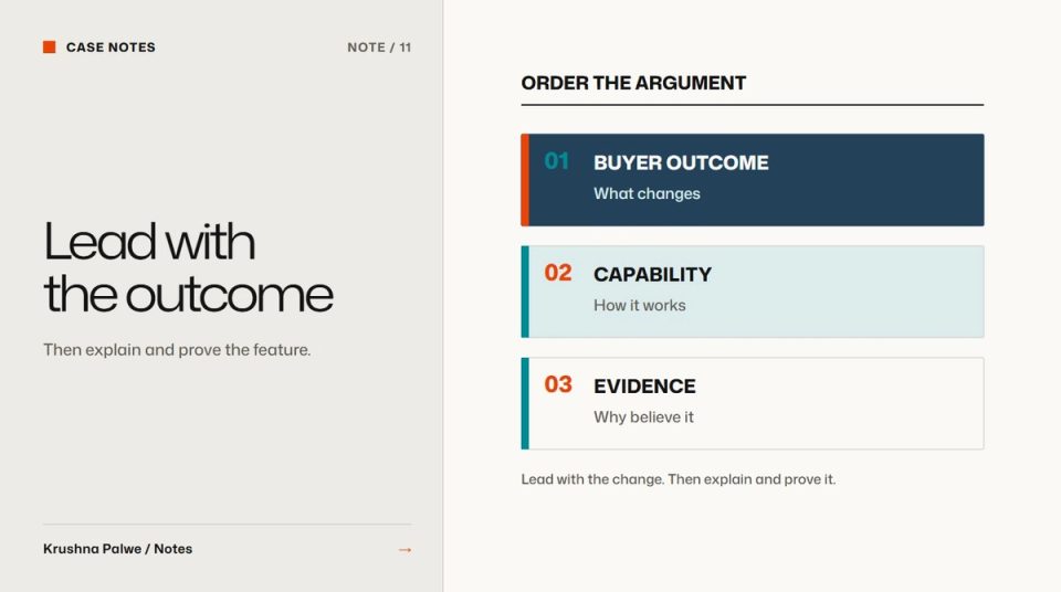
Designers are often handed copy at the end of a project and asked to make it look good. On B2B SaaS websites that is backwards. The words decide what the page argues, and the visual hierarchy can only make that argument clearer or louder. Outcome-first messaging is the discipline of leading with what changes for the buyer, then supporting it with the features that make it true.
On the Datamotive website I worked on brand language alongside the visual system. Feature-first copy became outcome-first, and hype became proof. The claims had to survive a cloud architect's reading. The visual system came together quickly. The language took three iterations, and in hindsight it should have started in the first week.
Why feature-first copy fails
Feature-first copy lists what the product does: agentless replication, multi-cloud support, automated failover testing. Every item is true, and none of them tells a buyer why they should care today. Worse, competitors often list the same features, so the page reads as interchangeable.
Hype-first copy fails differently. "Zero downtime, guaranteed" sounds strong until a technical reader asks how. In enterprise software, one claim that cannot be defended damages every claim around it.
Outcome-first copy sits between the two. It states a believable change for the buyer, then shows the mechanism.
Build a message hierarchy before writing pages
Write the messaging as a hierarchy, not as page copy:
- The core promise. One sentence about the outcome. For Datamotive the promise was that when infrastructure fails, recovery takes minutes.
- Three to four supporting outcomes. What the promise means for different parts of the job, such as predictable recovery, simpler migration, or consistent protection across environments.
- Proof for each outcome. The features, architecture and evidence that make each one true.
- Audience notes. What each buyer type needs to hear first.
Datamotive had four buyers: a CIO or CTO who needs predictable recovery and distrusts vague claims, a cloud architect who reads the diagrams first, an IT infrastructure manager who owns uptime, and a system-integrator partner who has to re-explain the value to their own clients. The hierarchy stays the same for all four. The order of emphasis changes by page.
Rewrite in three passes
For each existing headline or section, rewrite in three passes.
Pass 1: name the outcome
Ask what the feature makes possible for the buyer. "Agentless replication" becomes something about protecting workloads without adding software to every machine. Keep the language concrete. "Peace of mind" is not an outcome anyone can check.
Pass 2: remove what a sceptic would challenge
Read each line as the most technical person in the buying group. Remove absolute claims, invented superlatives and anything that depends on conditions the page does not state. At Datamotive a line about guaranteed zero downtime became one about building reliable failover readiness for the moments when recovery matters. The second line is less dramatic and much more believable.
Pass 3: attach proof
Put the supporting evidence directly under the claim: a diagram, a supported-platform list, a specification, a short explanation of the mechanism. A claim without nearby proof forces the reader to search for it, and most will not.
Treat word choices as positioning
Some choices that look like copy edits are strategic decisions. "Reliable recovery" and "eliminate downtime risk" can sound like synonyms. They are not. The first positions the product as dependable infrastructure. The second positions it as a risk-removal promise, which invites a different level of scrutiny. Decide these phrases with the same care as the logo, then lock them in the guidelines.
The visual identity should match the voice. A calm, exact system with shouting copy reads as two companies. I wrote about aligning those two in from brand personality words to visual decisions.
Let the design carry the hierarchy
Once the messaging is ranked, the page design follows:
- The core promise or a page-level outcome takes the headline.
- Supporting outcomes become section leads, not a grid of equal feature cards.
- Proof sits close to each claim, often as a diagram or product view.
- Actions match how convinced the reader is likely to be at that point.
The visual side of that ranking is in website visual hierarchy, the hero specifically in B2B SaaS website hero section, and the action phrasing in B2B CTA design.
A claim check before publishing
- Does each headline describe an outcome rather than a feature?
- Would a technical reader accept the claim without a footnote?
- Is the proof for each claim visible within the same section?
- Could a competitor use the same sentence unchanged?
- Do the key phrases match the locked messaging?
- Is the tone consistent with the visual identity?
Start the language early
The lesson I took from Datamotive is about timing. Messaging architecture deserves the same rigour as tokens, and it should happen in week one. Visual systems can be adjusted late. A positioning phrase that changes late forces rewrites across every page and asset already produced.
You can see the rewritten language in context in the Datamotive case study.