Brand Pattern Design: Building a Secondary Graphic From the Mark
How to design a brand pattern from the logo or a core motif: choose the unit, build the repeat, set scale and colour rules, and decide where the pattern belongs.
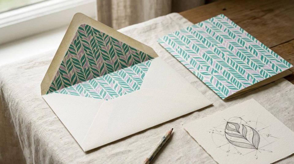
A logo cannot do every job. It is too precious to repeat across a whole surface and too small to carry a large empty area. That gap is usually filled with stock textures or gradients that belong to no one. Brand pattern design fills it with something that is recognisably the brand, even when the logo is not on the page.
I have built patterns and motif systems for two quite different identities. For Greenleaf, an interior design studio in Mumbai, the pattern came directly from the leaf glyph in the mark. For Datamotive, an enterprise software company, the motif was the hexagon and cube that already carried meaning in the logo. Both started from the same question: what is the smallest piece of this identity that can repeat without losing itself?
Choose the unit carefully
The unit is the shape that repeats. It can be:
- The symbol itself, used whole. Simple, but it can feel like wallpaper made of logos.
- A fragment of the symbol, such as a curve, a corner or a counter.
- A construction element, such as the grid or angle the logo was drawn on.
- A related motif that carries the same idea, without being the logo.
Greenleaf's pattern was a geometric repeat built from the leaf glyph. Because the glyph was already geometric, it tiled cleanly and stayed reproducible at any scale. At Datamotive the useful unit was the hexagon and cube. The guidelines documented what each meant, so the motif could extend into graphics without inventing new meanings.
Test the unit by repeating it twenty times. If it becomes noisy or starts to read as a different shape, try a simpler fragment.
Build the repeat on a grid
Patterns look intentional when the repeat follows a clear rule. Common structures:
- Straight grid: units in rows and columns. Calm and orderly.
- Half-drop or brick: each column offset by half a unit. Softer, less mechanical.
- Rotated or mirrored: units alternate direction. Adds movement.
- Scaled field: units change size across the surface. Useful for hero areas, harder to control.
Draw the repeat at the size of one tile and check every edge. A pattern that does not tile cleanly will show seams on large surfaces such as envelope linings, wall graphics or website backgrounds.
Set scale rules
Scale changes the character of a pattern. Small scale reads as texture. Large scale reads as a graphic. Define at least two:
- Texture scale for backgrounds, linings and secondary surfaces, where the pattern should sit quietly.
- Feature scale for covers, signage and campaign moments, where the pattern can be the image.
Also define a minimum scale, the point at which the unit becomes mush. On fabric, uncoated paper or a phone screen, that point arrives sooner than you expect. The same thinking applies to logos, covered in logo usage guidelines.
Set colour rules
Patterns can quietly break a colour system. Two rules help:
- Use tonal pairs by default. A pattern in two close tones of the same colour behaves like a texture and does not compete with content.
- Reserve contrast for feature uses. High-contrast patterns are images, so treat them like images and never put small text on them.
Greenleaf's palette set Sea Green and Grayish Green as primaries with Sugar Plum, French Lilac and Umber as accents, colours found in real interiors rather than wellness clichés. A pattern should draw on relationships like these rather than adding new colours of its own.
If text ever sits on a pattern, check contrast against the darkest and lightest parts of the pattern, not the average. Accessible colour pairs explains how I document that.
Decide where the pattern belongs
A pattern used everywhere stops being special. Write a short list of approved places. For Greenleaf, those included envelope linings, secondary surfaces and digital backgrounds. Typical good uses:
- Packaging interiors, linings and wraps.
- Stationery backs and envelope linings.
- Section backgrounds on websites, at texture scale.
- Social templates where a photo is not available.
- Signage panels and retail graphics.
Typical poor uses: behind body text, behind product photography, inside data charts, and anywhere the logo already appears large.
Make it reproducible
Deliver the pattern as a system, not a picture:
- The unit as a vector file, with its construction.
- Tiles for each approved repeat structure.
- Colour variants that match the approved pairs.
- Export sizes for screen, and print-ready files with bleed.
- A one-page rule sheet: scale, colour, placement, and what not to do.
If the brand has a design system, add the pattern as an asset with a name, the same way you add colour or type tokens. Design token naming covers how to keep names consistent between design and code.
Check it in application
Finally, test the pattern on real surfaces: a printed envelope liner, a website section on a phone, a sign at viewing distance. Patterns that look rich on screen can become loud in print, and patterns that look subtle in print can disappear on a bright display. Testing brand identity applications has the checklist I use.
You can see the leaf-glyph pattern and palette in the Greenleaf case study, and the documented hexagon and cube motif in Datamotive.