Design Token Naming: One Name From Figma to CSS
A practical design token naming convention: separate raw values from roles, name by job not appearance, and keep one name across Figma variables and CSS custom properties.
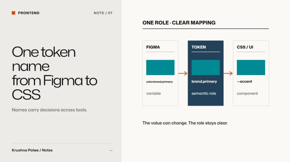
Most token systems that fail do not fail because of bad values. They fail because of bad names. A designer calls a colour "Teal Light", a developer calls it --color-4, and a third person adds --accent-new. Six months later nobody is sure which one to use. A design token naming convention is the agreement that stops this, and its most important rule is that the same decision has the same name on both sides of the handoff.
At Datamotive, Figma variables and CSS custom properties share names. $color.brand.primary in Figma maps to --accent in the components, and $spacing.lg maps to --spacing-lg. Components accept tokens only. That is what allowed three product identities to run on one system: a new product is new values, not new components. I described the overall approach in building a token-first design system. This note is only about naming.
Separate raw values from roles
Use two layers of names, and keep them apart.
Primitive tokens name the raw value. They answer "what is it?".
navy,teal,teal-600,soft-whitespace-1tospace-9
Semantic tokens name the job. They answer "what is it for?".
text,text-secondary,surface,surface-sunk,accent,rulespacing-sm,spacing-lg,section
Components use only semantic tokens. Semantic tokens point to primitives. When the brand changes, or a product needs its own accent, you change what the semantic token points to, and every component follows.
Datamotive's primitives carried a prefix and a scale step, such as --dm-navy, --dm-teal and --dm-teal-600. Product identity then became a matter of reassigning roles like --accent to a different primitive. This site works the same way: --ink, --ink-2, --paper and --signal are named by role, and each project page reskins the components by passing different values into five theme roles: surface, ink, secondary ink, accent and rule.
Name by job, not appearance
"Blue" stops being true the day the brand switches to green. "Large" becomes confusing when a larger size is added. Job-based names survive change:
accentrather thantealtext-secondaryrather thangrey-darksurface-sunkrather thanbeige-2dangerrather thanred
Primitives can describe appearance because they are values. Semantic names should never describe appearance.
Use a consistent grammar
Pick one order for the parts of a name and keep it everywhere. A common grammar is category, role, variant, state:
color-text-secondarycolor-accent-hoverspacing-section-small
Rules that help:
- Lowercase and hyphens in CSS. In Figma, slashes or dots create groups, so
color/text/secondarybecomes--color-text-secondaryin code. - No abbreviations people have to learn, except universal ones like
sm,mdandlg. - No numbers in semantic names unless they are a true scale.
- States as suffixes:
-hover,-focus,-disabled.
Make the mapping mechanical
The mapping between Figma and CSS should be predictable enough that nobody needs a lookup table. If the Figma variable is spacing/lg, the CSS property should be --spacing-lg. If you need a table to translate, the names are not aligned.
Where a short component-level name is useful, such as --accent inside a component, document the alias in one place: --accent points to --color-brand-primary. Then the long name is the source of truth and the short one is a convenience.
Document contrast with the colour names
Colour tokens should carry their accessibility rules with them. Datamotive's documentation lists each colour with its contrast and approved use: deep navy at 10.65:1 on white for text and diagrams, teal at 2.24:1 for decoration only, teal-600 at 3.47:1 for large text, icons and UI boundaries. When the name and the rule travel together, people stop using decorative colours for text. Accessible colour pairs covers that documentation in detail.
Plan for theming early
If there is any chance of multiple products, brands or a dark mode, design names that allow it from the start:
- Semantic tokens stay identical across themes.
- Each theme supplies its own primitive assignments.
- No component references a primitive directly.
Datamotive's three products share one grid, one type ramp and one component set. Only four parameters flex: primary colour, tone weight, information density and diagram register. A fourth product joins by setting values. That only works if names never mention a specific product's colour. The brand side of that structure is covered in brand architecture for a multi-product SaaS company.
Review names like code
Treat token names as an interface. Changing a name breaks everything that uses it. Before adding a token, ask whether an existing one already does the job. Before renaming, list what depends on it. Version changes and announce them, as described in design system governance for small teams.
A naming checklist
- Are primitives and semantic tokens clearly separated?
- Do components reference only semantic tokens?
- Does every semantic name describe a job, not an appearance?
- Is the grammar the same across colour, spacing, type and elevation?
- Can a Figma variable name be converted to its CSS name without a table?
- Do colour tokens carry contrast and approved use?
You can see the shared-name handoff and the three product identities in the Datamotive case study.