Testing Brand Identity Applications on Real Surfaces
A checklist for testing a brand identity on garments, packaging, signage, screens and print before launch, so problems surface in mockups instead of production.
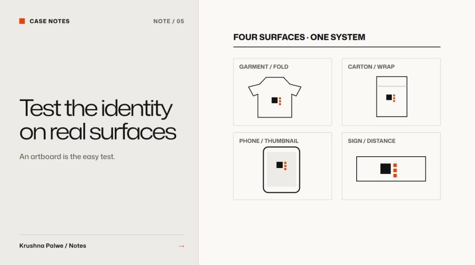
An identity that looks finished on a white artboard has only passed the easiest test. The real tests happen on a folded t-shirt, a carton under shop lighting, a phone in sunlight, a sign seen from across a street. Testing brand identity applications is how you find out whether the system holds before anyone pays to print it.
I test applications as part of the identity work, not after it, because a failed application is cheapest to fix while the system is still open.
Choose applications by risk, not by appeal
The temptation is to mock up the glamorous things: a billboard, a tote bag, a shiny box. Choose instead the applications that are most likely to break the system or that the business depends on most:
- The smallest use: favicon, social avatar, woven label, app icon.
- The most physical use: embroidery, foil, uncoated paper, signage materials.
- The busiest background: product photography, lifestyle images, video.
- The densest layout: packaging back panels, data sheets, invoices.
- The most frequent use: whatever the team will make every week, such as social posts, slides or listing images.
For BLANKSY that meant garments, packaging and the storefront. For Greenleaf, an interior studio, it meant stationery, signage and digital guidelines. For CITTA, a skin-care brand, it meant cartons, labels and sachets only a few centimetres wide.
Test on the garment
Apparel adds constraints that screens hide. BLANKSY's guidelines include garment placement rules, because a mark that works on a storefront header does not automatically work on fabric. Write each placement as a position and a size range, then test it on real garment proportions, across sizes. A placement that looks centred on a medium sits oddly on an extra-large.
Check the production method too. Embroidery needs a simplified mark at small sizes, and minimum sizes for embroidery are larger than for print. Screen printing changes how fine lines and tight gaps behave.
Test in the box
Packaging tests should cover the structure, not just the front face. Build the dieline, fold it, and look at it from the angles a customer will: on a shelf, in a hand, opened on a table. BLANKSY's packaging direction was low-complexity materials with high identity discipline, so the test was whether one mark and one colour rule could carry an unboxing without extra decoration.
For CITTA, every carton was checked against the printer's die before release, with bleed and finish specs confirmed. The front illustration and wordmark carried the brand, but the side and back panels carried the information, and they had to survive the same system. Packaging label typography covers the hierarchy side of that.
Test on the screen
Digital applications need testing at real sizes and on real devices:
- The logo in a browser tab, a header at 320 pixels wide, and a social avatar cropped into a circle.
- Brand colours on both light and dark interfaces, checked for contrast.
- Typography at body size on a phone, not just as display type on a large monitor.
- The identity in motion if it will be animated. See motion logo design.
Test at distance
Signage and retail displays are read from metres away, often in seconds. Print a section at real size, tape it to a wall and walk back. Greenleaf's identity was built to work on signage as well as stationery. CITTA's retail work included a standee, shelf headers, shelf strips and danglers, all of which had to read at a glance from an aisle.
Use mockups honestly
Mockups are useful for testing, but they flatter. A photographic scene adds lighting, depth and texture that the flat artwork does not have. Two rules keep them honest:
- Always look at the flat artwork as well. In my portfolio, print artwork sits beside its presentation mockup and each is labelled, so nobody mistakes a render for the production file.
- Label concept imagery. BLANKSY's application spreads use concept imagery and mockups for visualisation, and the case study says so. I wrote about that policy in labelling AI-generated imagery.
A testing checklist
For each application, record:
- Does the mark meet its minimum size and clear space?
- Is the right logo variant used for this surface?
- Do colour pairs meet contrast at this size and in this light?
- Does type remain legible at the real reading distance?
- Does the layout hold with real content, including the longest product name?
- Does the production method support the detail in the artwork?
- Would someone recognise the brand with the logo covered?
Failures go back into the system as rule changes, not one-off fixes. If the mark fails on a woven label, the answer is a new compact asset with its own minimum size, documented in the logo usage guidelines.
When to stop testing
Stop when each risky application has passed once and the rules that came out of failures are written down. You do not need forty mockups. You need evidence that the hardest cases work and a system that explains why.
The BLANKSY case study shows the identity on garments, packaging and the storefront, and CITTA Packaging shows print artwork beside every presentation mockup.