From Brand Personality Words to Visual Design Decisions
How to turn brand personality words into decisions about colour, type, spacing, imagery, and motion, with a translation table and tests that rule options out.
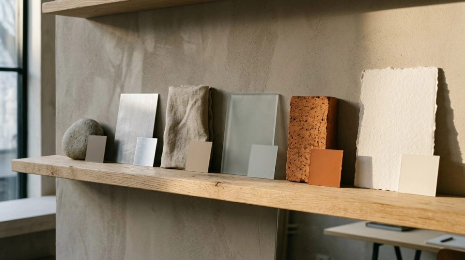
Every brand workshop produces adjectives. Bold, human, premium, innovative, trustworthy. The trouble is that each reviewer pictures something different, so the words end up approving whatever the loudest person already liked. Brand personality in visual design only becomes useful when each word is translated into decisions that someone could check.
This is how I make that translation, using two systems I designed: Datamotive, an enterprise cloud-resilience company, and BLANKSY, an everyday-apparel label.
Write fewer words, and make them exclude things
Five or six words is plenty. More than that and they start to contradict each other. Datamotive's personality was locked at six: clear, reliable, technical, calm, enterprise-grade, foundation-first. BLANKSY's behaviours were four: open, assured, adaptable, human.
The test for each word is whether it rules something out. "Calm" rules out neon gradients, aggressive motion and stacked exclamation marks. "Innovative" rules out almost nothing, which is why it rarely survives my first pass. If a word would fit every competitor in the category, it is a value statement, not a personality, and it belongs somewhere else.
A competitive visual audit helps here. When you know the category uniform, you can pick words that place the brand somewhere specific rather than somewhere pleasant.
Build a translation table
For each word, write what it means for each part of the visual system. Keep the cells concrete enough to settle an argument.
Colour
- Calm shows up in Datamotive's palette as a deep navy for text and dark surfaces, a soft white page, and teal restricted to accents and diagrams. No saturated gradients behind content.
- Assured is how I read BLANKSY's colour rule: monochrome first, a single action colour, and seasonal colours kept out of the structure so the identity does not change every collection.
Typography
- Technical and clear show up as a plain pairing: Plus Jakarta Sans at 700 for headings, Inter at 400 for body, one type ramp across all three products.
- Human sits behind BLANKSY's custom wordmark, which is readable first and distinctive in its details, while the supporting type stays plainly useful.
Layout and spacing
- Foundation-first became a working principle called Architectural Fluidity: sections separated by tone, spacing and hierarchy rather than heavy borders. I wrote more about it in website section rhythm.
- Open connects to a BLANKSY grid that keeps negative space active, echoing the aperture in the symbol.
Imagery and diagrams
- Reliable became the rule set for diagrams: one line weight, flow lines in one direction, labels never sitting on the lines, and animation only for active flows. A cloud architect reads diagrams first, and inconsistency there reads as risk. The full approach is in diagram system for a complex product.
- Adaptable connects to BLANKSY's one master symbol, with five responsive assets cut from it, from a 16 pixel favicon to the storefront header, with the geometry never redrawn.
Language and motion
Personality applies to words too. "Calm" removed hype from Datamotive's copy. A headline promising guaranteed zero downtime became one about building reliable failover readiness. That rewrite did as much for the personality as any colour choice. See outcome-first messaging for the method.
Test options against the words, not taste
Once the table exists, design reviews change. Instead of "I like the second one", the question becomes "which option is calmer?" or "which one is more technical without becoming cold?".
I use three tests:
- The removal test. Remove the logo. Can people still tell which brand the page belongs to? If not, the personality lives only in the mark.
- The contradiction test. Put the most technical and the most promotional piece side by side. Do they still feel like one personality, or two companies?
- The swap test. Swap in a competitor's colour palette. If the work still feels the same, colour is not doing personality work, and something else needs to.
Expect some words to resist translation
Some words are about behaviour rather than visuals. "Human" can mean warmer photography, but it also means answering support emails in plain language and labelling concept imagery honestly. At BLANKSY the store marks concept products and sample reviews as exactly that. That is a personality decision expressed as policy, not styling.
When a word cannot be translated into at least two visual or verbal rules, either cut it or move it into a values document where it belongs.
Keep the table alive
The translation table becomes part of the guidelines. Each rule should point back to a word, so anyone extending the system later knows why it exists. When a new request arrives, a campaign or a product launch, check it against the words first. That is how a personality holds up across teams, not through enforcement but through shared reasoning.
The Datamotive case study shows the six words applied across three products, and BLANKSY shows four behaviours carried from the symbol to the storefront.