A Spacing System for Websites: Scale, Tokens, and Rules
How to build a spacing system for websites: a small fixed scale, fluid page margins and section gaps, named tokens, and grouping rules that keep layouts consistent.
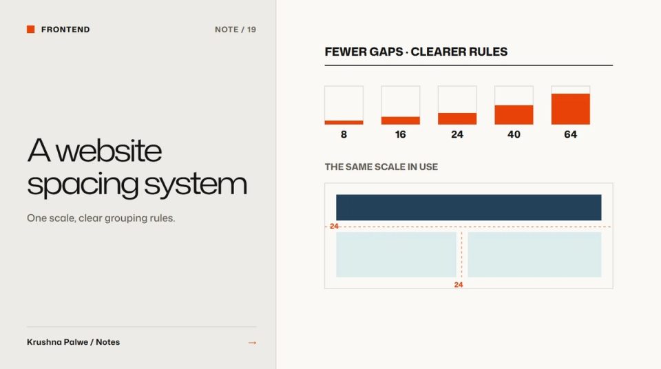
Spacing is the decision designers make most often and document least. Every padding, margin and gap is a small choice, and without a system each one gets made fresh. The result is a site where cards have 22 pixels of padding on one page and 26 on the next, and nobody can say which is right. A spacing system for websites replaces those hundreds of small choices with a short scale and a few rules.
This site is the worked example. Its spacing is a set of named tokens in one stylesheet, and the same approach ran through the Datamotive design system, where spacing tokens such as $spacing.lg in Figma map directly to --spacing-lg in CSS.
Start with a small fixed scale
The core of a spacing system is a scale of fixed steps. This site uses nine:
- 4, 8, 12, 16, 24, 32, 48, 64 and 96 pixels.
The scale starts on a 4 pixel base and the steps grow as they get larger. Small steps are close together because fine adjustments matter at small sizes, such as the gap between an icon and its label. Large steps are far apart because a difference of a few pixels between sections is invisible.
Nine steps is enough for almost everything inside a component. If you find yourself wanting a value between two steps, the usual answer is that one of the neighbours is fine. Resist adding steps. Each new step weakens the system.
Name the steps neutrally, such as --s-1 to --s-9, so the scale can be adjusted later without names becoming untrue.
Make page-level spacing fluid
Fixed steps work inside components. Page-level spacing needs to respond to the viewport, or desktop layouts feel cramped and mobile layouts feel empty. CSS clamp() handles this cleanly. On this site:
- Page margin scales from 20 pixels on a phone to 72 on a wide screen.
- Gutter between grid columns scales from 12 to 24 pixels.
- Section spacing scales from 88 to 184 pixels, with a smaller section token from 56 to 112.
Each of these is one token with a minimum, a preferred value tied to the viewport width, and a maximum. Designers and developers both refer to the token, not the numbers. Website section rhythm explains how the section tokens shape the pace of long pages.
Name tokens by job where it helps
Raw scale steps are primitives. Some spacing decisions deserve job names on top:
--mfor the page margin.--gfor the gutter.--sectionand--section-sfor gaps between sections.--header-hfor the height of the fixed header.
Job names make intent visible in code and in design files. When someone reads padding-block: var(--section), they know it is a section boundary, not an arbitrary 120 pixels. The naming principles are covered in design token naming.
Write grouping rules
A scale tells you which values are allowed. Grouping rules tell you which one to use. The most important rule: space inside a group is smaller than space between groups. That is how readers see structure without borders.
Practical rules for a website:
- A heading sits closer to the text below it than to the content above.
- Items in a list or grid have equal gaps, smaller than the gap around the list.
- A label sits closest of all to the field or item it labels.
- Padding inside a card is smaller than the gap between cards.
These rules are what turn a scale into layouts that read correctly. Without them, a system with perfect tokens can still produce pages where headings float between sections.
Tie spacing to the grid
Spacing and grid work together. This site runs on a twelve-column grid with fluid gutters, and you can press G anywhere to see it. Content blocks align to columns, and vertical spacing uses the scale. When horizontal and vertical decisions both come from the system, layouts feel calm even when they are dense.
Keep spacing consistent across type sizes
Spacing around text should account for type size. A large heading needs more space above it than a small one. Rather than inventing values, pick scale steps that grow with the type roles: a small step under a label, a medium step under a section heading, a large step above a display heading. The type side of this is in how to build a brand typography system.
Audit spacing regularly
Spacing drifts quietly. Every few months:
- Search the codebase for raw pixel values in margins, paddings and gaps. Each one is a candidate for a token.
- Check the most-used components in the design file for values off the scale.
- Compare three pages side by side for section gaps.
AI coding tools are useful here, because they can list every hard-coded spacing value quickly. Deciding which should become tokens remains a design decision. That division of work is the one I describe in AI-assisted design workflow with human review gates.
A spacing checklist
- Is there one fixed scale, with fewer than ten steps?
- Are page margin, gutter and section spacing fluid tokens?
- Do components use only scale values?
- Is space inside groups always smaller than space between groups?
- Are headings closer to their content than to the section above?
- Are there no raw pixel values left in component styles?
You can see the same token discipline applied to a three-product SaaS system in the Datamotive case study.