Packaging Label Typography: Hierarchy When Space Runs Out
How to set type on packaging labels and sachets: a fixed panel structure, a three-level hierarchy, legibility at small sizes, and checks against the printed piece.
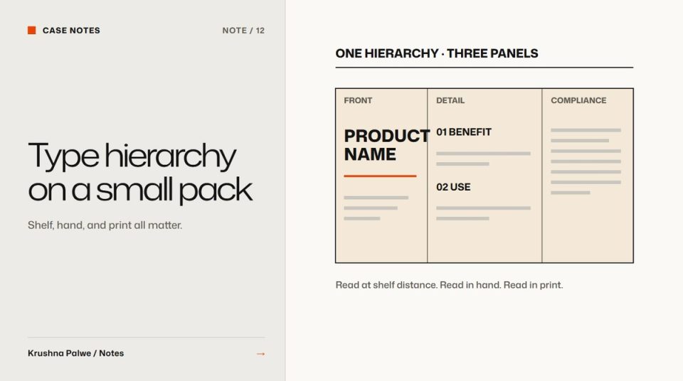
A packaging label has the hardest typographic brief in design. It must sell from across an aisle, explain the product in a hand, and carry ingredients, directions and compliance details, all on a surface that might be a few centimetres wide and curved around a bottle. Packaging label typography works when the hierarchy is decided once, as a structure, and every product fits into it.
I designed more than 33 packaging pieces for CITTA, a natural baby- and skin-care brand: cartons, wrap labels, gift boxes and five sample sachets. I also designed the tube pack for Eatovito, a millet pasta. This note covers the type decisions that held up across those formats.
Fix the panel structure first
Before choosing sizes, decide which information lives where. On CITTA's adult-care range, every label shares one grid:
- Left panel: the brand story.
- Centre panel: the wordmark and product block, on a colour field.
- Right panel: ingredients, directions and compliance.
That structure held across four quite different label sizes, from 154 by 134 millimetres for a shampoo to 99 by 46 for a serum. A new product changes the colour, the illustration and the copy. The structure stays.
A fixed structure is a typographic decision, even though it looks like layout. It means the reader always knows where to look, and the designer never has to rethink hierarchy for each new product.
Use three levels, not seven
Small labels cannot carry many levels of hierarchy. Three is usually enough:
- Identify: brand and product name. The largest, highest-contrast type.
- Persuade: the key claim or benefit, such as a pH or age badge, or a short claims block.
- Inform: ingredients, directions, warnings, manufacturing details. Small but legible.
On CITTA's Baby and Kids packs, the wordmark and range line lead, a badge on a sunburst carries the pH or age claim, and the claims sit on a soft hill shape at the base. The shape itself becomes a hierarchy device: it tells the reader that this is the claims zone without needing a heading.
Design for the smallest format first
The sachet is where the system is tested. CITTA's tester sachets for pharmacy counters and gift boxes had to fit the same system into a few centimetres: wordmark, product name, animal illustration and claims hill on the front; ingredients, directions and manufacturing details on the back.
Designing the sachet early exposes problems sooner: claims that were too long, illustrations that crowded the name, type sizes that only worked on cartons. If a system works on the smallest format, scaling up is easy. The reverse is rarely true. That is part of what I meant in the CITTA case study when I wrote that the system should have been locked at the start, with a shared template library for dielines and claims blocks.
Legibility rules for small type
At small sizes, typeface choice matters more than style:
- Choose open, sturdy faces with generous x-heights and clear letter shapes for informational text. Fine hairlines disappear in print.
- Avoid light weights for small informational text. Thin strokes can fill in or break up, depending on the stock and the print method.
- Keep contrast high. Pastel product colours are lovely as fields and poor as text backgrounds. Put informational text on the lightest available area.
- Avoid reversed small text (light on dark) where possible, especially with fine detail.
- Watch curvature. A wrap label for a 19 millimetre lip balm stick, like CITTA's 80.16 millimetre wrap, curves sharply. Text near the edges becomes hard to read when the product is held.
Local labelling regulations set minimum sizes and mandatory content for many product categories. Check the rules for each market before finalising, and treat them as the floor, not the target.
Make information readable in use
Packaging is read twice: once at the shelf or on a screen, and again at home. Eatovito's nutrition and cooking instructions were built for that second reading: legible on a phone in a marketplace listing, then again in a kitchen. Nutrition values were set per serving and per 100 grams, each tied to its percentage of the recommended daily allowance, so the table answered the question a buyer actually asks. The cooking steps used line icons drawn to match the pack pattern, so instructions felt like part of the brand rather than a legal panel.
Check against the printed piece
Screen proofs lie about small type. Before release:
- Print the label at actual size on the actual stock if possible, or at least on similar paper.
- Wrap it around the real container.
- Read every line of informational text at arm's length in normal room light.
- Check that text sits clear of folds, seams and the die line, with bleed and finish specs confirmed against the printer's die.
On CITTA every carton was checked against the printer's die before release. Type that crosses a fold or sits too close to a cut line is a common and expensive mistake.
Connect the pack to the listing
Most packs now also appear as marketplace images, often at thumbnail size. The hierarchy that works on the shelf should survive there too. CITTA's listing images were designed alongside the packs so pack and marketplace told one story, and Eatovito's listing was built to win a three-second thumbnail on a phone. Template systems for high-volume design work covers how to keep those outputs consistent, and testing brand identity applications covers checking the identity across physical formats.
You can see the label grid, sachets and print artwork beside every mockup in CITTA Packaging, and the nutrition design in Eatovito.