Product Brochure Layout: Designing a Repeating Spread
How to lay out a product brochure or detailer around a repeating spread: an opening story, a hero page and details page per product, and a grid that absorbs uneven content.
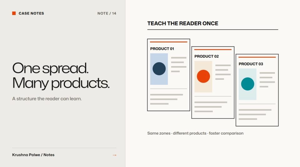
A product brochure with ten products can be designed as ten unrelated layouts or as one layout used ten times. The first approach takes longer, looks less coherent and breaks every time a product is added. A good product brochure layout is built around a repeating spread: a structure every product fits into, so the reader learns how to read it on the first spread and moves faster on every one after.
I designed a 24-page product detailer and an eight-page retailer catalogue for CITTA, a natural baby- and skin-care brand. The two pieces served different readers with different needs, but both were built on the same idea.
Know who is reading and where
Start with the reading situation, because it decides how much detail each spread carries.
- CITTA's product detailer was a booklet for doctor and pharmacy visits. Its readers were healthcare professionals who care about ingredients and formulation, often reading while a representative talks.
- The retailer catalogue was for trade partners. They care about the range, pack sizes, sets and prices, and they read it to make ordering decisions.
Same products, different questions. That is why they became two pieces rather than one brochure trying to serve both.
Open with a short story, then get to the products
After the cover, the detailer opens with four pages of brand and formulation story before any product: recognition, the brand philosophy, formulation, and why the brand is different. That opening sets context once, so individual product pages do not have to repeat it.
Keep the opening short. Readers picked up the brochure for the products. Two to four pages is usually enough, and the opening should share the same grid and type roles as the product spreads so the change of section feels like a chapter, not a different document.
Design the repeating spread
In the detailer, every product gets a spread: a hero page, then a details page. The hero page carries the product image, the name and the main benefit. The details page carries ingredients, benefits and usage in a repeating grid.
This structure has three advantages:
- Readers learn it once. By the third product, they know where the ingredients are without looking.
- The layout absorbs new products. Adding a product means adding a spread, not redesigning the booklet.
- Production is faster and safer. Fixed text boxes and image frames reduce layout errors and make proofreading systematic.
Write down the spread as a template: the position and size of each element, the type role for each text level, and the maximum length of each text block.
Build a grid that handles uneven content
Real products do not have equal amounts of content. One has twelve ingredients, another has four. One has a long usage instruction, another has none. The grid has to absorb that without the spread looking empty or crowded.
Techniques that help:
- Modules rather than fixed boxes. The details page is divided into modules, ingredients, benefits, usage, that can grow or shrink within the grid.
- A consistent top alignment, so even when modules have different heights, the page starts the same way every time.
- Optional modules with defined positions, such as a clinical note or a caution, that appear only when needed.
- Copy limits agreed with whoever writes the text, so content is edited to fit the system, not the other way round.
The same principle of fixed, variable and conditional parts is covered in information design systems at scale.
Adapt the spread for the trade
The retailer catalogue used a different repeating unit, because the questions were different. Its pages covered the baby care range, sunscreen, lip balm and bathing bars, care combinations, gift boxes and travel pouches, each with pack sizes and a price table. The unit was the range or set rather than the single product, and the price table was the anchor element on every page.
That is the point of a repeating spread: it is designed around the reader's main question. For professionals, it was "what is in it and how is it used?". For retailers, it was "what can I stock and at what price?".
Keep the visual language consistent with the packs
Brochures sit next to the products they describe. CITTA's packaging used one pastel colour per product and an ingredient or character illustration. Carrying those cues into the detailer meant a reader could match a page to a pack on the counter. Consistency between pack and print is part of the system, covered further in packaging label typography.
Check the printed booklet
Before release, print a full proof at actual size:
- Check the spine and gutter, where text and images can disappear in a saddle-stitched or bound booklet.
- Confirm page count is a multiple of four for saddle stitching.
- Read each spread as a pair, because readers see two pages at once.
- Proofread modules systematically: every ingredients block, then every usage block.
A brochure layout checklist
- Is the reader and reading situation defined?
- Is the opening story four pages or fewer?
- Does every product follow the same spread structure?
- Can the grid absorb the longest and shortest product content?
- Is the main reader question anchored on every spread?
- Do visual cues connect the brochure to the packaging?
You can page through all 24 detailer pages and the eight catalogue pages in CITTA Print and Campaigns, and see the packs they describe in CITTA Packaging. For decks built on the same thinking, see pitch deck design as a slide system.