Competitive Visual Audit: How to Map a Category Before You Design
How to run a competitive visual audit: choose the right set, capture it consistently, code the conventions, map the clusters, and find the position nobody holds.
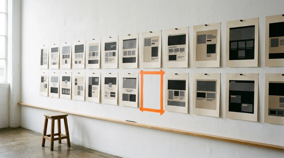
Most categories have a uniform. Healthy food wears kraft brown and hand-drawn type. Interior studios wear beige, thin sans-serifs and soft lifestyle photography. Enterprise software wears either dark mode with neon gradients or dense grey dashboards. A competitive visual audit makes that uniform visible, so you can decide on purpose whether to wear it.
I treat this as a separate exercise from an internal brand audit. The internal audit asks whether a brand is consistent with itself. The competitive audit asks whether it is distinct from everything around it. Mixing them tends to produce one conclusion: copy the leader.
Choose a set that reflects the buyer, not the founder
Founders usually name the competitors they admire. Buyers compare against whatever appears next to the product: the search results page, the marketplace grid, the shortlist a procurement team builds, the rail in a store.
For BLANKSY I audited twenty sites, ten Indian and ten international, because the buyer shops both. For Eatovito the real comparison was a marketplace results page where a shopper sees several "healthy alternative" pastas side by side on a phone. For Datamotive the set was the disaster-recovery and cloud-migration vendors an IT team would shortlist.
A useful set usually has three layers:
- Direct competitors the buyer would genuinely compare.
- Aspirational brands from the same category, including at least one the client dislikes.
- Adjacent categories that share the buyer's attention or habits.
Ten to twenty brands is enough. Beyond that you start recording noise.
Capture everything the same way
Inconsistent capture produces false conclusions. If one homepage is screenshotted on desktop and another on a phone, you will read differences that are only about viewport.
For each brand capture the same set: homepage on desktop and mobile, one product or service page, the logo on its own, packaging or the product in context where relevant, two or three social posts, and one piece of advertising. Note the date. Brands change, and an audit is a snapshot.
Code the conventions, not your opinions
Lay the captures out in a grid and code each brand against the same attributes:
- Colour temperature and saturation: warm or cool, muted or loud, light or dark ground.
- Type character: geometric, grotesque, humanist, serif, script, custom.
- Imagery mode: product on white, lifestyle, illustration, 3D render, diagram, none.
- Density: how much information appears before the first scroll.
- Tone of claims: technical, emotional, playful, premium, clinical.
- Proof: what evidence each brand shows, and where.
Use short codes rather than adjectives. "Warm, muted, light ground, grotesque, lifestyle, low density" is comparable across twenty brands in a way that "feels clean" never is.
Map the clusters
Once coded, the brands sort themselves. Plot them on two axes that matter for the buyer, such as tone and maturity, and look for the empty quadrant. At Datamotive the category split into two registers: dark neon that read as startup, and grey density that read as legacy enterprise. The open position was warm, calm and exact, mature without being old.
At Greenleaf the cluster was so tight that it read as default: minimal sans-serifs, beige, lifestyle photography. Distinctive enough to escape that, disciplined enough never to perform, became the brief.
At BLANKSY the pattern was a different kind of sameness. Indian essentials brands competed on "minimal", and almost none published the numbers a buyer needs. That gap was not visual at all. It was informational, and it shaped the identity's idea: compete on specification instead of minimalism.
Separate conventions from clichés
Not every shared pattern should be broken. Some conventions carry meaning the buyer relies on:
- Functional conventions help people use the product: a cart icon, a price near the button, a diagram that reads left to right. Keep them.
- Trust conventions reassure a cautious buyer: security information, specifications, clear contact paths. Keep them, and do them better.
- Aesthetic clichés signal membership and nothing else: the kraft brown, the neon gradient, the beige. These are where differentiation lives.
Eatovito is the clearest example from my own work. The category signalled "healthy" with muted kraft packaging. The pack went the other way, saturated red with an orange accent taken from tomato cuisine, and put the cooked pasta beside the raw product, because the most common question on a listing is what it looks like once cooked. The convention it kept was the functional one: nutrition information laid out so it could be read on a phone.
Turn the map into a brief
The audit is only useful if it changes the brief. I end with four statements:
- The category uniform: what most brands look and sound like.
- What the buyer still lacks: the question no one answers well.
- The position to own: written as a sentence the client can reject.
- The conventions to keep: so the new identity does not break what helps people buy.
Those four lines are what I take into turning personality words into visual decisions. Without them, adjectives like "bold" or "premium" mean whatever each reviewer wants.
Common mistakes
- Auditing only logos. The uniform is usually in the imagery, density and claims, not the mark.
- Auditing only the leaders. The long tail shows where the category is heading.
- Treating difference as the goal. Being different from the category is useless if the result does not fit the buyer. Distinct and appropriate is the target.
- Skipping the date. Six months later nobody remembers which version you captured.
You can see the market audit behind the identity in the BLANKSY case study, the category reframe in Eatovito, and the escape from the interior-design default in Greenleaf.