Motion Logo Design: An Animated Identity Built for Many Videos
How to design a motion logo and a reusable animation library that keeps timing, easing and colour consistent across a whole slate of campaign videos.
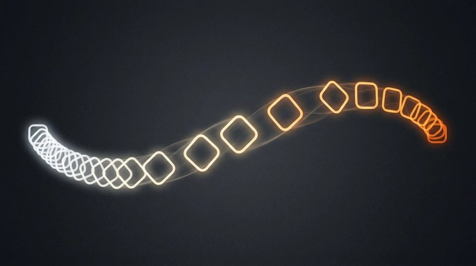
A motion logo is usually commissioned for one launch video and then forgotten. Every later video gets built from scratch, with different timing, different easing and different transitions, so the brand moves like a different company each time. Motion logo design works best when the animated mark is the anchor of a system that the next ten videos can reuse.
I learned this at Devsnest, where I produced campaign videos for Radix's domain extensions, including .store, .online and .tech. The slate kept growing, explainers, social cuts and promos, and there was no animated identity. Every video started from zero. The fix was a motion logo and a reusable After Effects library, which then opened more than ten campaign videos.
Start from the mark's structure
Good logo animation reveals how the mark is built rather than decorating it. Before animating anything, study the static logo:
- What is the core shape, and can it be drawn, assembled or revealed?
- Where is the natural reading order: symbol then wordmark, or the reverse?
- What does the brand promise, and which kind of movement expresses it? Precise and mechanical, soft and organic, quick and playful?
Write three or four motion principles in plain words, the way you would write personality words for a static identity. "Snappy entrances, calm holds, no bounce" is enough to guide dozens of decisions. The static equivalent of this step is in from brand personality words to visual decisions.
Design the motion logo in versions
One animation is rarely enough. A useful motion logo has:
- A full reveal for openings and closings, two to four seconds.
- A short sting for social cuts and transitions, under two seconds.
- A loop or idle state for live streams, waiting screens and backgrounds.
- A static end frame that matches the approved logo exactly, so the animation always resolves into the real mark.
The static end frame matters more than it sounds. If the final frame drifts from the master logo by a few pixels or a slightly different colour, every video ends on an off-brand mark.
Build the library around the logo
The motion logo is the anchor. The library is what makes the next video faster to make. At Radix the After Effects project held:
- Transitions between scenes.
- Lower thirds for names and titles.
- Kinetic type presets for headlines.
- Animated icons that matched the visual style.
Each element shared the same timing language as the logo, so a video assembled from library parts still felt like one piece.
Build it for change
The most useful decision was to design every component so it could be changed safely:
- Colour from one control. Campaigns needed colour changes, so the library let a colour be swapped in one place rather than recoloured layer by layer.
- Stretchable holds. A title might need to stay on screen for two seconds in one cut and four in another. The animations were built so a hold could be extended without breaking the in and out timing.
- One set of easing curves across everything. Shared easing is the motion equivalent of a type ramp. It is what makes different videos feel related even when their content is unrelated.
If you work in After Effects, expression controls and essential graphics properties are the practical way to expose those controls without letting people break the animation inside.
Write motion guidelines people will use
Motion guidelines can be short:
- The motion principles, in a sentence each.
- The easing curves, with names and values.
- Standard durations for entrances, exits and holds.
- Which logo version to use for which video format.
- Safe areas for each aspect ratio: 16:9, 9:16, 1:1.
- A list of things not to do, such as adding bounce to the logo or using stock transitions.
Include short reference clips. Motion is hard to describe and easy to show. The same logic of rules plus examples applies to static systems, as covered in brand guidelines vs brand system.
Plan for every format
Campaign videos rarely live in one format. The same message runs as a landscape explainer, a vertical reel and a square post. Design the logo and library for all three from the start:
- Check that the full reveal works in a 9:16 frame without crowding.
- Build lower thirds that reflow for vertical video.
- Keep text inside safe areas so platform interface elements do not cover it.
Test sound as well. A short audio signature paired with the logo reveal can carry recognition when people scroll without looking, and it should follow the same principles as the animation.
Measure consistency, not just output
Motion at scale is a systems problem disguised as a creativity problem. The measure of the library is not the most impressive single video. It is whether the tenth video still opens with the same logo, moves with the same easing, and was quicker to make because nothing had to be rebuilt.
That same instinct, designing the thing that makes the assets rather than each asset, runs through template systems for high-volume design.
You can watch three of the published campaign pieces and see how the library was structured in the Radix case study.