Variable Fonts in Brand Systems: One Family, Several Voices
How to use a variable font in a brand system: pick the axes that matter, define named type roles as fixed axis settings, subset for performance, and set a matched fallback.
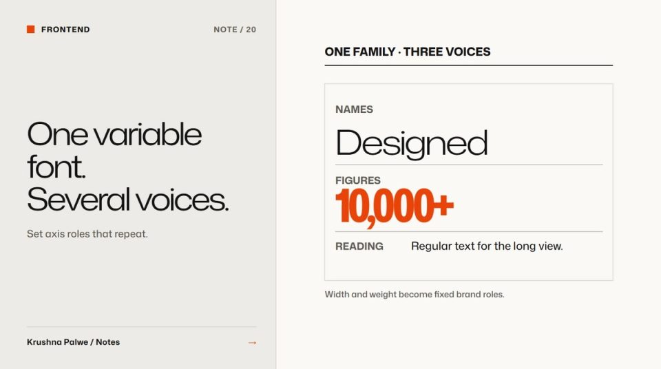
Brand systems used to need several font families to get several voices: a wide display face for impact, a condensed one for numbers, a text face for reading. Each one is another file to load, license and keep consistent. A single variable font can carry all three, because weight and width become continuous axes rather than separate files. Used carefully, variable fonts for brand systems give more range with less to manage.
This site is set in one variable family, Mona Sans, used at three main settings: wide and light for names, condensed and heavy for figures, regular for reading. This note explains how that works and what to watch for.
Choose a family with the axes you need
Variable fonts can have many axes, but most brand work needs two:
- Weight (
wght), from thin to black. - Width (
wdth), from condensed to expanded. In CSS this isfont-stretch.
Some families add optical size, slant or custom axes. Check what the brand actually needs before choosing. Mona Sans covers weights from 200 to 900 and widths from 75% to 125%, which is enough range to make headings, names and figures feel distinct while still clearly belonging to one family.
Also check language support and licensing. A family that lacks a currency symbol or a script your market uses will force a second font anyway. This site loads a separate tiny subset just for the rupee sign, scoped with unicode-range so it only downloads when the glyph appears.
Define roles as fixed axis settings
The risk of a variable font is too much freedom. If every designer picks their own weight and width, the brand loses consistency faster than it would with three static fonts. The fix is to define named type roles, each with fixed axis values, and use only those.
On this site the roles include:
- Body: weight 420 at 100% width, for comfortable reading.
- Names: weight 330 at 125% width, wide and light, used for project names.
- Figures: weight 720 at 75% width, condensed and heavy, with lining tabular numerals, used for headline counts.
- Display: weight 540 at 110% width, the main voice of the site.
- Headings: slightly less wide as they get smaller, from 108% for the second level to 104% for the third.
Each role also fixes letter spacing and line height, because those need to change with width and weight. Wide settings usually need tighter tracking at large sizes. Condensed heavy figures need tight line height so stacked numbers do not drift apart.
Roles live as CSS classes or tokens. Nobody types font-stretch: 117% in a component. The broader method for defining roles is in how to build a brand typography system.
Give each voice a job
The three voices on this site are not decoration. They map to the idea of the portfolio: a system on one side, its outputs on the other. Wide light names are the instances, condensed heavy figures are the outputs, regular text is the explanation. When each voice has a job, people learn to read it, and the system stays consistent because a new element has an obvious role to borrow.
Without jobs, variable fonts tend to drift into novelty: animated weights, headlines at unusual widths for no reason. A useful test is to remove one voice and see whether something is lost. If not, it was not doing a job.
Mind performance
One variable file can be smaller than several static weights, but not always. Variable fonts with many axes and large character sets can be heavy. Steps that help:
- Subset to the characters you need. This site's upright Latin subset is under 100 KB for the full weight and width range.
- Split rare glyphs into separate subsets with
unicode-range, as with the rupee sign. - Preload only the main file.
- Use `font-display: swap` so text appears immediately.
Set a metric-matched fallback
When the web font swaps in, layout can jump if the fallback has different proportions. A metric-matched fallback reduces that shift. This site defines a fallback face based on Arial with size-adjust, ascent-override and descent-override tuned so the swap barely moves the text. It is a small step that protects both the reading experience and layout stability scores.
Test the extremes
Variable fonts can behave unexpectedly at the edges of their range. Check:
- The widest and heaviest settings in long headlines, at mobile widths.
- The condensed settings at small sizes, where counters can close up.
- Numbers in every role, especially if tabular figures are used for alignment.
- Italic or slanted styles, if the family has them, at the same axis settings.
- Rendering on Windows and Android, not only on a high-density Mac display.
Readability still comes first
A flexible family does not change the basics. Body text still needs a comfortable size, line length and line height. Readable body text on the web covers those settings, and typography resources for brand and digital work lists tools for exploring variable axes before you commit.
A variable font checklist
- Does the family have the axes and language support the brand needs?
- Are type roles defined with fixed axis values?
- Does each voice have a clear job?
- Is the font subset, with rare glyphs split out?
- Is there a metric-matched fallback?
- Have the extremes been tested on real devices?
You can see the three voices at work across the work index and the colophon on the about page.