Pitch Deck Design: Build a Slide System, Not a Single Deck
How to design a pitch deck as a reusable slide system: a grid, a small set of slide types, rules for data and claims, and a master file a team can extend.
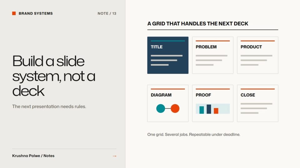
Most companies do not have a deck problem. They have a decks problem. Sales has one version, the founder has another, marketing made a third for an event, and each lives on its own grid with its own fonts. A single beautiful pitch deck does not fix that. A pitch deck slide system does: a grid, a small set of slide types, and rules that let anyone build the next deck without starting over.
At Datamotive, decks on incompatible grids were one of the clearest signs that one company was reading as three. The weekly queue of decks, campaigns and events never paused, so the system had to work for people building slides under deadline. For CITTA I designed a twelve-slide brand pitch deck that covered the brand, the range, the launch campaign and the business plan. Both taught me that a deck is a product with users, not a one-off artefact.
Start with the slide grid
Slides need a grid as much as web pages do. Define:
- Safe margins that stay constant on every slide.
- A column structure, usually twelve columns at 16:9, so content can sit in halves, thirds or two-thirds.
- A title zone in the same position on every content slide, so the audience always knows where to look.
- A footer zone for slide number, section or source notes, if used.
When every slide shares margins and title position, transitions between slides feel calm, even when the content changes completely. That is the presentation equivalent of website section rhythm.
Define a small set of slide types
Most decks can be built from eight to twelve slide types:
- Cover.
- Section divider.
- Statement: one large sentence.
- Text and image.
- Three-point summary.
- Product or range overview.
- Diagram or process.
- Chart or data.
- Comparison or table.
- Quote or proof.
- Team.
- Closing and next step.
CITTA's deck moved through cover, brand overview, about, brand promise, who we are, current and upcoming ranges, influencer marketing, launch campaign, sales projection, digital marketing KPIs and the digital push plan. Mapped onto slide types, that sequence needs only a handful of layouts reused with different content.
Build each type as a master layout in the presentation tool, with placeholders for text and images. People should choose a layout, not draw one.
Write rules for text
Slides fail most often through too much text. Rules that help:
- One idea per slide. If a slide needs two headings, it is two slides.
- Headlines as sentences that state the point, not labels like "Overview".
- A maximum line count for body text on each slide type.
- Minimum type size that is readable from the back of a room or on a shared screen in a video call.
Use the brand's type roles rather than inventing deck-specific ones. If the brand has a display face and a text face, the deck uses the same two. How to build a brand typography system covers how roles carry across touchpoints.
Be strict about data and claims
Decks often carry numbers that matter: market size, projections, results. Two rules protect credibility:
- Label targets as targets. CITTA's deck included sales projection and digital KPI slides. Those figures were the business plan's targets, not results, and when I show the deck in my portfolio I say so. Presenting a projection as an achievement is the fastest way to lose an informed audience.
- Source every external figure on the slide, in the footer zone.
Chart design should follow the brand colour roles: one emphasis colour for the data that matters, neutral tones for everything else. A chart where every bar is a different brand colour says nothing.
Use diagrams for complex ideas
For technical products, a good diagram does more than three bullet slides. A diagram standard like Datamotive's, simple nodes, one line weight, flow in one direction, should govern slides as well as the website, so a sales deck and a product page explain the architecture the same way. Diagram system for a complex product covers the rules.
Deliver a master file and examples
The deliverable is not the deck. It is:
- A master file with every slide type as a layout.
- Colour and font settings embedded in the theme, so defaults are correct.
- An example deck built entirely from the layouts.
- A one-page guide: which slide type for which job, text limits, data rules.
- An image library with approved photography and product renders.
Keep the master in one shared location. Decks multiply by copying old decks, so retire old versions explicitly or they will keep coming back. Printed sales material benefits from the same approach, as described in product brochure layout.
Govern it lightly
Review new decks occasionally rather than approving every one. Look for repeated workarounds: if people keep building a slide type you did not provide, add it to the system. If they keep breaking a rule, ask whether the rule is wrong. The general approach is in design system governance for small teams.
A deck system checklist
- Does every slide share margins and title position?
- Are there fewer than twelve slide types, all built as layouts?
- Are headlines written as statements?
- Are targets labelled as targets and external figures sourced?
- Do charts use one emphasis colour?
- Is there one master file, with old versions retired?
You can see the twelve-slide brand deck alongside the print and campaign work in CITTA Print and Campaigns, and the problem of decks on incompatible grids in Datamotive.