Information Architecture for a Multi-Product SaaS Website
A practical IA model for multi-product SaaS websites, covering product discovery, parent-company navigation, use cases, proof, and page transitions.
When a SaaS company has several products, navigation has to help two kinds of visitors: the person who already knows the product name, and the person who only knows the problem they need to solve. A flat product list serves neither very well.
Information architecture is the relationship between those paths. It should make the product family visible without asking every visitor to understand the company's internal structure.
Start with entry questions
List the questions behind likely entry points:
- I know the product name. Where is its page?
- I know the operational problem. Which product helps?
- I need to compare products. What is shared and what differs?
- I want to evaluate the company. Where is the proof?
- I am ready to talk. What is the lowest-risk next step?
Use the questions to group pages, not the org chart. The brand architecture guide covers the identity relationship. IA turns that relationship into navigation and page paths.
Use a product family layer
A multi-product site usually needs a family-level page or navigation surface that explains the parent company and the product set. Each product then gets a clear landing page with its own outcome, workflow, proof, and next action.
The family layer should not repeat every product page. It should help a visitor choose. A comparison or use-case path may be more useful than three equal cards with vague descriptions.
Design transitions between pages
Every transition should preserve context. A product page should make it clear which family it belongs to. A case study should name the product and link back to the relevant solution. A demo CTA should carry the selected product or use case into the next step when possible.
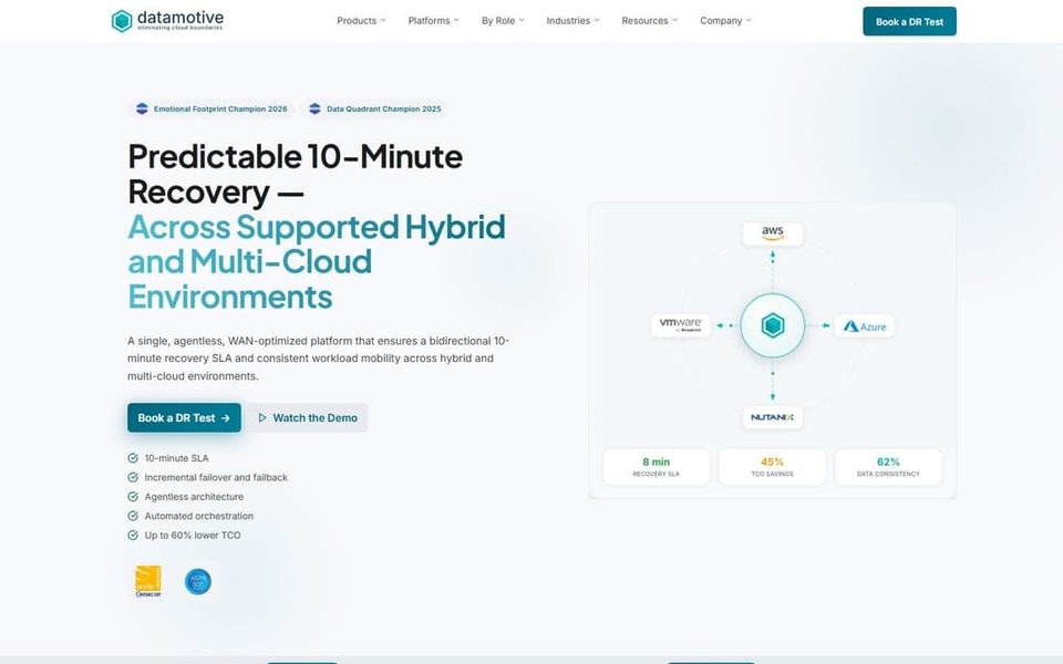
At Datamotive, the visual system had to make several product identities coherent. The case study is a useful reminder that IA and visual identity cannot be separated when a buyer moves between product and company levels.
Choose navigation labels people can say
Test labels in sentences. Can a buyer say, I need help with X, so I opened Y? If the label only makes sense to the internal team, add a descriptor. Product names can stay distinctive while navigation explains the job.
Avoid forcing a use-case taxonomy that the company cannot maintain. Three broad, accurate paths are better than nine categories that overlap and require constant explanation.
Make proof findable
Case studies, architecture diagrams, product screenshots, and trust information should not live in a disconnected archive. Link them from the page where the buyer asks the related question.
The enterprise trust signals guide explains how adjacency changes credibility. IA gives that evidence a place in the journey.
A multi-product IA test
- Can a new visitor explain the product family after one page?
- Can a returning visitor reach a named product in one or two actions?
- Can a problem-led visitor discover a product without knowing its name?
- Can a technical evaluator find the relevant workflow or diagram?
- Do product, company, proof, and contact pages preserve context?
- Are navigation labels distinct, maintainable, and visible in search snippets?
The best multi-product architecture reduces the number of guesses a visitor must make. It is a content and visual system that helps the right product feel findable and the parent company feel present.