Trust Signals for Enterprise SaaS Websites: What to Show and Where
A visual hierarchy for enterprise SaaS trust signals, from product evidence and architecture diagrams to people, proof, and responsible claims.
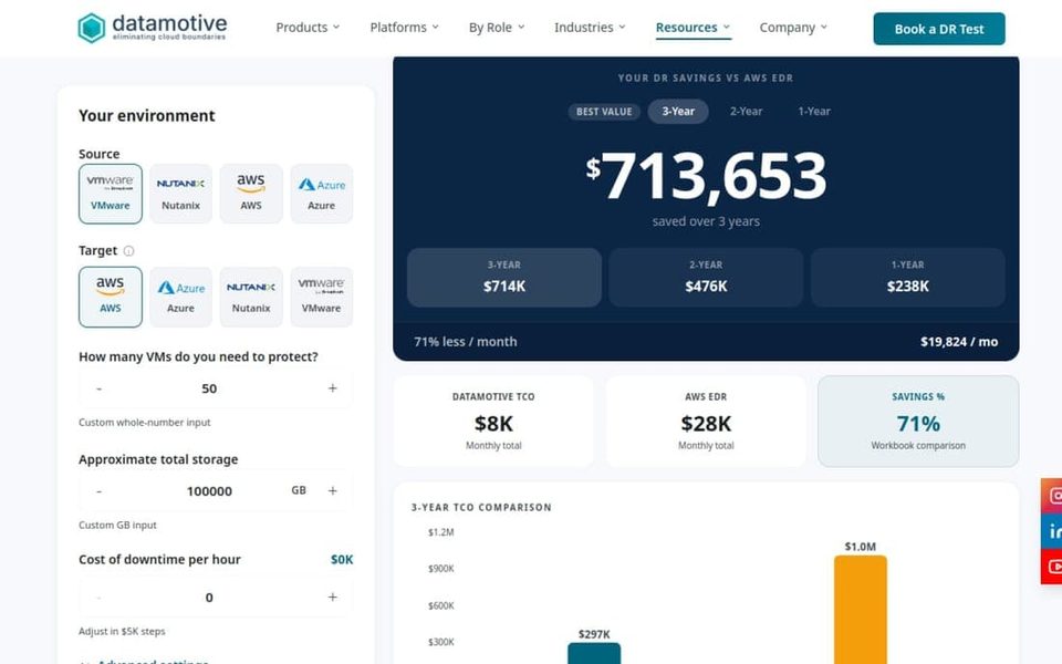
Trust on a SaaS website is not a decorative layer added after the brand is finished. It is the result of making important claims easy to inspect. A buyer wants to know whether the product fits, whether the company understands the risk, and whether the team can support the decision after the demo.
The mistake I see most often is treating trust as a row of logos, badges, or vague adjectives. A visual system can help trust signals arrive at the moment they answer a real question.
Map the questions before the signals
Different visitors need different kinds of proof. A technical evaluator asks whether the product architecture is credible. A business owner asks what changes operationally. A procurement team asks whether the company is dependable. A champion inside the account asks whether the decision can be explained to other people.
Write the questions first, then choose the evidence:
- Fit: What does the product do, and for whom?
- Operation: What will the team actually use?
- Risk: What happens when something fails?
- Company: Who is responsible for the outcome?
- Proof: Where can the claim be checked?
This is the same reasoning used in a B2B SaaS brand system: clarity and trust are system behavior, not visual mood.
Put each signal near its decision
The strongest trust signal is often the one closest to the moment of doubt.
The hero should establish fit and outcome. It is a poor place for a dense security checklist because the buyer has not yet learned what the product is.
The first product explanation should show operation. Use a screenshot, workflow, or short sequence that reveals what is real rather than a generic dashboard collage.
The architecture section should answer risk. A diagram can show boundaries, integrations, recovery states, or the relationship between services. Its labels should be precise enough for a technical reader without forcing every visitor into engineering detail.
The case-study section should answer proof. Make the work scannable: situation, decision, visual evidence, and outcome. If a metric is not available, show the shipped artifact and explain the constraint instead of inventing a number.
The contact or demo section should answer responsibility. A real person, role, or process is more useful than another abstract promise.
Avoid the badge wall
Badges can be useful when they are relevant, current, and explained. They become noise when they are presented as a visual pattern without context.
For every badge, certification, customer logo, or award, ask:
- What decision does this help the buyer make?
- Is the claim current and first-party verifiable?
- Does the surrounding copy explain its scope?
- Would a short case or workflow teach more than the badge?
If the answer to the last question is yes, lead with the workflow. Enterprise buyers are not impressed by a page that looks confident. They are reassured by a page that is specific.
Use diagrams as evidence, not atmosphere
A technical diagram can be one of the most persuasive elements on a SaaS website, but only if it preserves the relationships that matter. Use a consistent symbol vocabulary, line weight, and labeling pattern. Separate the business outcome from the infrastructure detail with hierarchy rather than two unrelated illustration styles.
At Datamotive, the visual language had to support more than one product identity. The reusable system made the company feel coherent while allowing the product story to change. The result is more useful than a single dramatic hero illustration because it can be reused in product pages, decks, and conversations with technical buyers.
Read how to build a diagram system for a complex product, then compare it with how to explain a complex SaaS product visually.
A page-zone trust audit
I score an enterprise SaaS page by asking whether each zone answers a different question:
- Hero: Is this for me, and what changes?
- Explanation: How does it work?
- Evidence: What can I inspect?
- Risk: What happens at the edges?
- Company: Who owns the relationship?
- Action: What is the least risky next step?
If three zones repeat the same generic benefit, the page has a content hierarchy problem. If one zone carries every technical detail, the page has a sequencing problem. If the proof only appears in a footer, the page has an adjacency problem.
The visual designer's role is to make the evidence readable at the right time. That is the difference between a polished SaaS page and a credible one. The SaaS website design service exists for precisely this kind of information and visual system work.