A Visual Identity System: Components, Rules, and Real Deliverables
A practical guide to building a visual identity system from logo behavior, typography, color, imagery, layout, motion, and reusable deliverables.
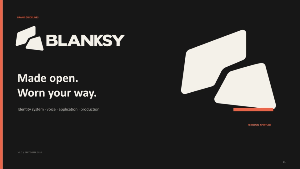
A visual identity system is the set of repeatable decisions that lets a brand look and feel recognizable when the content, channel, and people making it change. It is more useful than a logo package because it explains how the identity behaves.
The system should be specific enough to guide a real deliverable and flexible enough to support a new one. I build it from components, rules, examples, and the reason each decision exists.
Begin with recognition, not decoration
List the assets that already carry recognition: a shape, a wordmark, a color, a type detail, a photography behavior, or a recurring layout. A rebrand that replaces everything can discard recognition the organization has already built.
Then identify the problem the system must solve. Is the brand inconsistent across teams? Does the website feel unrelated to the sales deck? Does the product look like a different company? A system has a job beyond looking polished.
The core components
Logo and symbol behavior
Document the full lockup, compact lockup, symbol, minimum size, clear space, and background use. Explain when to remove detail and when a simpler mark becomes too generic. Responsive logo work is about context, not merely making a file smaller.
Typography roles
Choose roles before individual sizes: display, section heading, body, label, data, and caption. Define the relationship between weight, width, line length, and spacing. The brand typography system guide goes deeper into this layer.
Color roles
Use semantic names and define contrast behavior. The existing color-system note explains why a single brand color is not enough. A visual identity system should also state where color must not be used and what happens in grayscale or low-light contexts.
Imagery and graphic language
Describe subject, framing, light, crop, texture, and the amount of visual noise the brand can carry. Include examples that show what changes between campaign imagery and product or case-study evidence.
Layout and spacing
Define the grid, section rhythm, safe areas, and how the system behaves in responsive layouts. A strong layout rule makes the brand recognizable even when no logo is visible.
Motion and behavior
If motion is part of the identity, document pace, easing, reveal order, and the moments where motion should stop. Motion should explain a state or reinforce a hierarchy, not become a decorative layer that competes with the message.
Turn rules into deliverables
A system is proven by outputs. Build examples for the places the team actually works:
- website and landing page;
- product or technical communication;
- sales deck and case study;
- social or campaign asset;
- print, packaging, or retail application;
- email or document template.
Each example should show the input, the decision, and the reusable rule. The CITTA packaging system demonstrates how a brand can stay coherent across many physical packs and product messages. BLANKSY shows a different challenge: keeping a restrained fashion identity consistent as it moves into a Shopify storefront.
Make the system teachable
Guidelines should answer what to do next. Use short decision trees, annotated screenshots, and good and bad examples. A new contributor should be able to make a reasonable first draft before asking for a live explanation.
This does not remove creative judgment. It protects judgment for the decisions that are genuinely new.
Maintain the system
Name a source of truth, a maintainer, and a lightweight review path. Record exceptions. Audit a sample of real outputs. Update the rules when repeated exceptions reveal a missing pattern.
Read brand guidelines vs brand system and design-system governance for small teams for the operating layer.
A visual identity system is successful when a viewer can recognize the brand and a team can explain the decision. It is both a language and a production tool. That is why identity work can support a brand and web design engagement rather than ending at a logo presentation.