Greenleaf visual proof
-
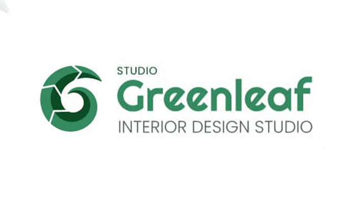
Logo system
-
Palette
-
Typography
-
Stationery
-
Application
What this case proves
Greenleaf is an interior design studio with a specific point of view: the gap between aspiration and execution. Clients arrive with Pinterest boards full of rooms they love and no idea how to get there. The studio bridges that gap.
Brief: identity that signals translation work. Not loud. Not trendy. The kind of brand a homeowner trusts with their living room and a developer trusts with a 30-unit block.
Interior design branding defaults to minimal sans-serifs, beige palettes, and lifestyle photography. The category is so saturated with “quiet sophistication” that it no longer reads as sophistication. It reads as default.
Three audiences:
- Homeowners (35+): renovating or redecorating, Pinterest-led
- Business owners (35+): offices that signal seriousness
- Developers / Architects: reliable creative partner at volume
Each had to recognise themselves without the brand fragmenting.
The bet: distinctive enough to escape default, disciplined enough to never feel performative.
Visual logic:
- Custom wordmark with a leaf glyph: literal, precisely executed
- Primary palette offset toward grey-greens and silvers (away from wellness greens)
- Secondary accents: Sugar Plum, French Lilac, Umber, colours that show up in real interiors
- Righteous for the wordmark, Poppins for everything else
Logo system: Primary mark, horizontal lockup, monogram, square avatar. Each version built for a specific surface.
Palette: Six tones with hex, RGB, CMYK, Pantone. Sea Green and Grayish Green as primaries; Sugar Plum, French Lilac, Umber as accents.
Typography: Righteous for the wordmark. Poppins for body, humanist, readable, full weight range.
Imagery direction: Mood boards across residential, commercial, hospitality. Photography style for portfolio and marketing.
Pattern system: Geometric pattern from the leaf glyph. Reproducible at any scale. Envelope linings, secondary surfaces, digital backgrounds.
Application: Full stationery suite, signage, and digital guidelines.
"Pinterest boards, translated into rooms."
| METRIC | RESULT | NOTE |
|---|---|---|
| Brand assets delivered | Full system | Logo, palette, type, pattern, application |
| Color palette | 6 tones | 3 primary + 3 secondary, contrast-balanced |
| Typography stack | 2 typefaces | Righteous (logo) + Poppins (body) |
| Application coverage | 100% | Stationery, signage, digital, print |
Interior design is a category where the brand has to feel like the work: measured, considered, never loud. The hardest discipline in identity design isn't standing out. It's standing exactly where you should and nowhere else.