Datamotive visual proof
-
-
-
-

-
Datamotive token sheet
What this case proves
What was true at the start.
Three products, three brand voices, three colour systems. To an enterprise buyer, EasyMigrate, EasyHybridDR, and EasyProtect read as three different companies. The brand existed; the system holding it together didn't.
My point of view going in.
Foundations before components. Components are the wrong first step when you do not yet know what a component should contain.
Datamotive sells one promise: when cloud infrastructure fails, you recover in minutes. But its three products looked like they came from three different companies.
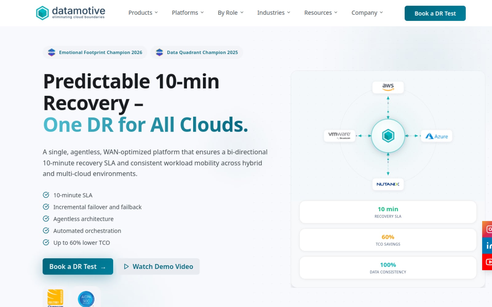
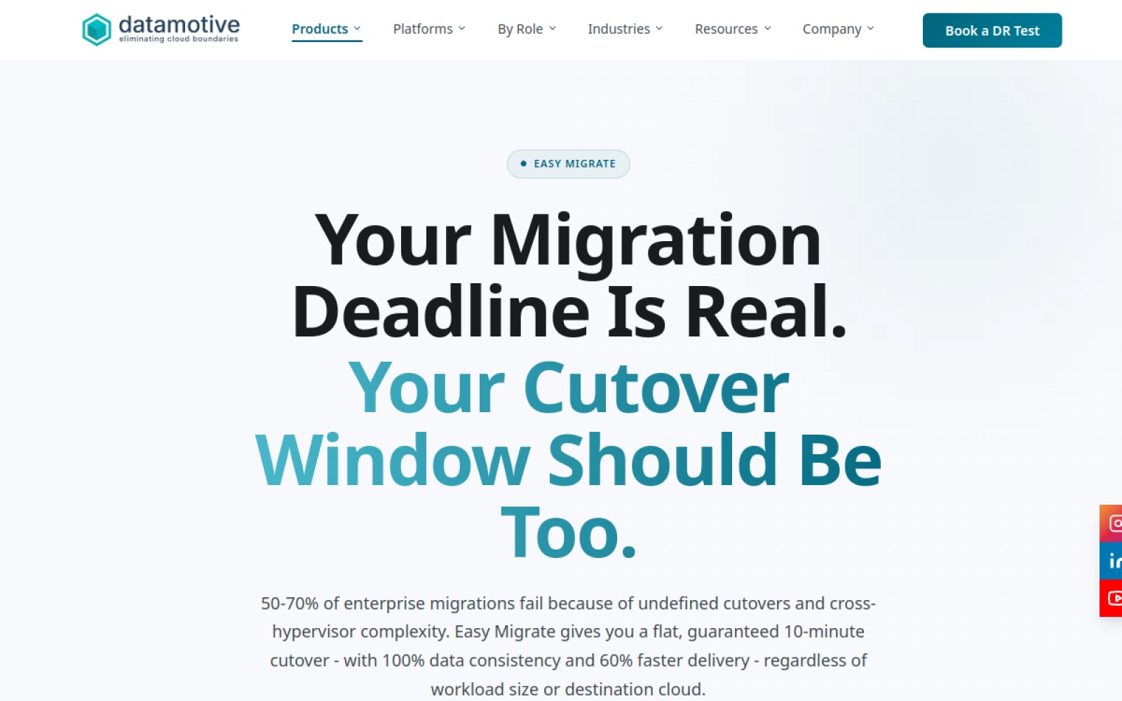
EasyMigrate, EasyHybridDR, and EasyProtect had each grown on their own. The website showed different type weights on adjacent pages. Marketing decks sat on incompatible grids. Social posts from different quarters didn’t look related.
The technical diagrams hurt most. For an enterprise buyer evaluating disaster recovery, diagrams are a trust signal. These had inconsistent line weights, arbitrary colour, and no rule for how data flow was shown.
A cloud architect reviewing the materials couldn’t tell whether this was one company or three vendors. The brand was there. The system holding it together wasn’t.
BEFORE / AFTER · SAME PROMISE, ONE SYSTEM
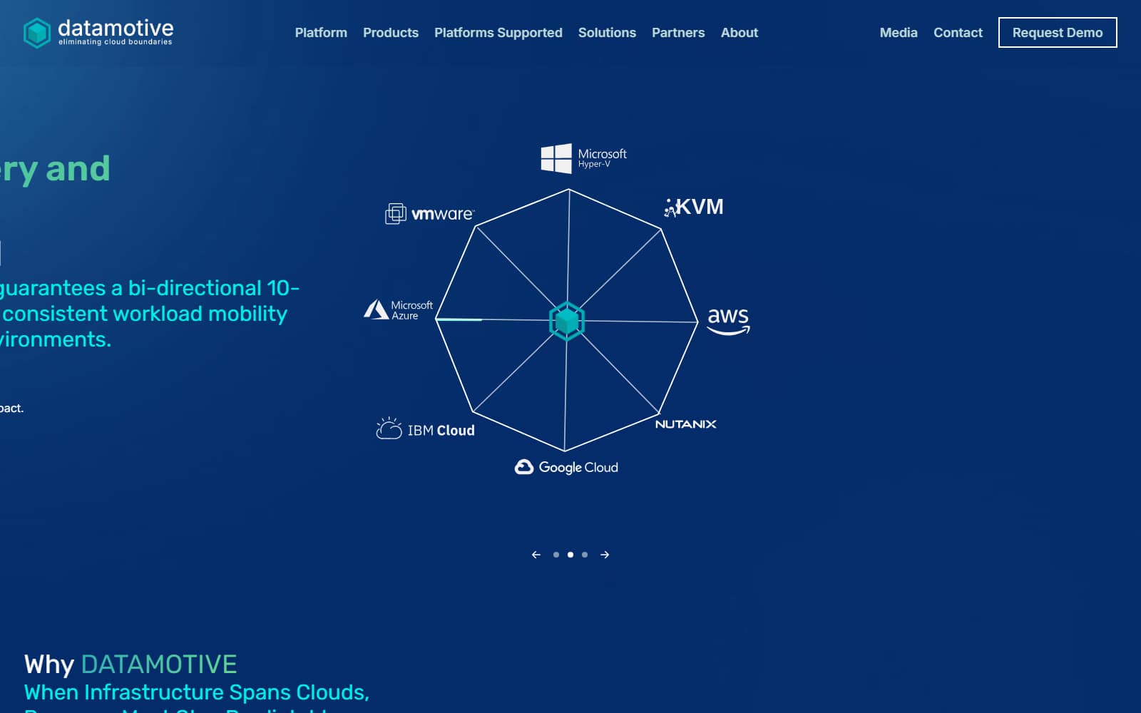
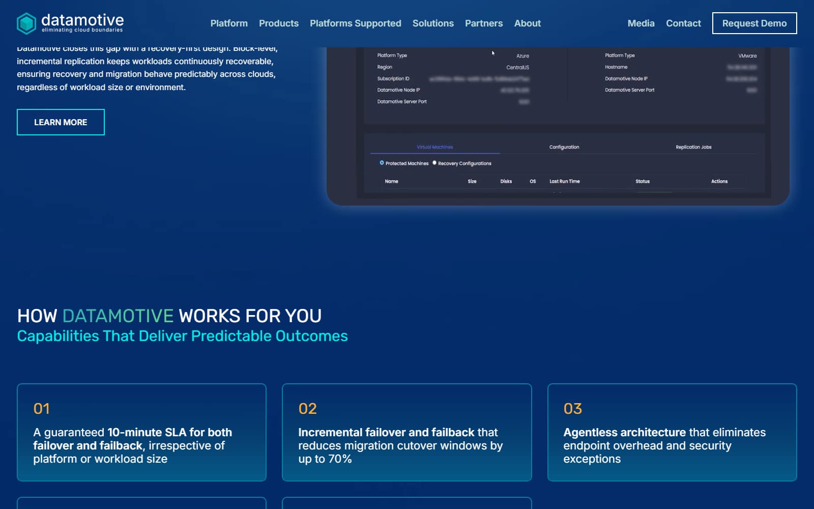
Same products, same promise. The rebuild puts every page on one grid, one type ramp, and one colour logic, so EasyMigrate, EasyHybridDR, and EasyProtect finally read as one company.
This was not a focused project with a clear runway. It was a full-time job with a design system being built inside it.
Every week still brought product UI, sales decks, campaign assets, social content, and the occasional emergency. No dedicated frontend engineer. No design system budget.
One thing made it possible: a shared belief that a unified system would make every later deliverable faster and better. Build it once, profit every week after.
I didn’t start with components. Components are the wrong first step when you don’t yet know what should go inside them.
I started with decisions. What is the brand’s primary colour, and what jobs does it do? What type sizes exist, and what does each one mean? What spacing is allowed, and on what grid?
Each decision became a token: one named value, defined in one place, used everywhere. Building a card stopped being “what shadow should this have?” answered twenty times in twenty slightly different ways. It became “which elevation token applies here?” Answered once.
Figma and the codebase speak the same language. $color.brand.primary in Figma is --accent in code, $spacing.lg is --spacing-lg. Change a token in one place and the change carries everywhere. No translation. No drift.
The React components accept tokens only, never raw colour or spacing values. So a new product identity needs new token values, not new components.
And because the same person designed and built everything, nothing was lost in handoff. The reasoning behind every spacing and type decision survived into the code.
A brand system with sixteen documented foundations, from logo usage and colour tokens through to diagram standards and developer handoff.
- Three product identities (EasyMigrate, EasyHybridDR, EasyProtect) sharing one token set, each with its own primary palette
- A technical diagram standard covering migration, replication, failover, and recovery flows
- Datamotive.io rebuilt from scratch: React, Tailwind CSS, Server Components, deployed on Vercel with Sanity as CMS
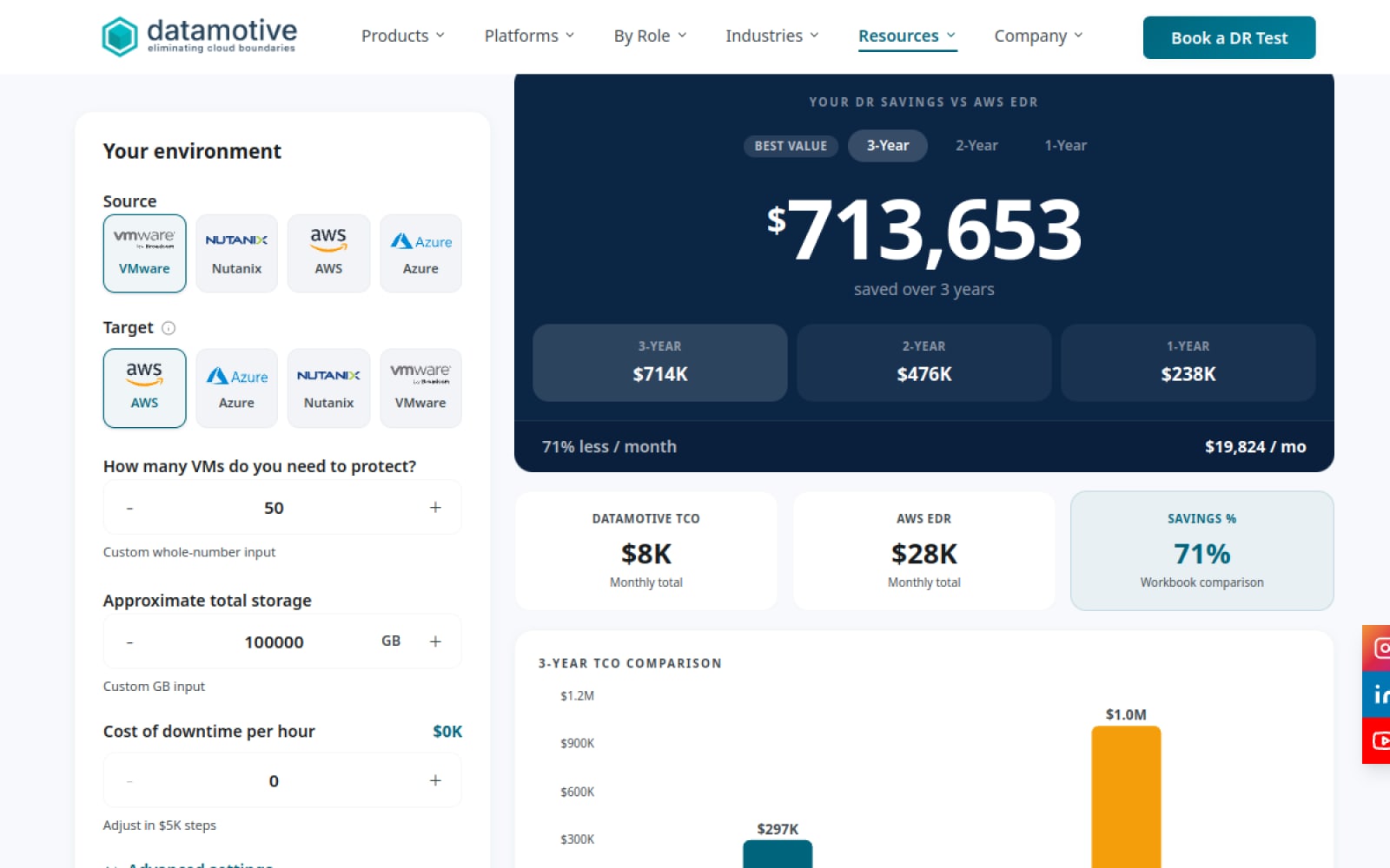
- A TCO calculator that compares cross-cloud DR costs, built as a lead converter on the site
All of it shipped alongside the normal weekly output of a full-time visual design role, digital and print.
Datamotive: enterprise cloud migration and DR. Agentless, multi-cloud, 10-minute recovery SLA. Three product lines had grown in fragments: separate colours, separate voices, separate UI. To enterprise buyers, it read as three companies.
Founder’s direction: evolve, don’t redesign. The hexagon, cube, and teal had meaning and recognition. Strengthen the foundation. Preserve the meaning.
The challenge: build a system rigorous enough that three product teams could ship in parallel, while I was still handling every other task as a full-time visual designer.
Competitive research took three days with Claude. The pattern across cloud migration and DR tools: dark mode, neon accents, abstract circuitry. The category reads as either “startup” or “legacy enterprise,” with little in between.
That gap was the opportunity: a warm, confident register. Mature without old. Trustworthy without boring.
A 15-area brand audit mapped what needed formalising: logo rules, colour tokens, type scale, grid, component anatomy, diagram conventions, proof modules, dev handoff. The core (hexagon, cube, teal, “eliminating cloud boundaries”) was strong. The system around it was missing.
Four enterprise buyers, four mindsets:
- CIO / CTO: Business continuity. Predictable recovery, executive confidence. Doubts vague claims.
- Cloud Architect: Migration design, failover. Technical diagrams, precise language. Loses trust when marketing oversimplifies.
- IT Infrastructure Manager: Uptime and DR readiness. Reads operational credibility into design consistency.
- System Integration Partner: Easy-to-explain value, partner-friendly materials. Can’t sell a fragmented brand.
Same brand. Four profiles. One coherent voice, and a system that holds across all of them.
The system is called Architectural Fluidity.
Picture stacked sheets of matte architectural glass. Sections separate through tonal shifts, spacing, and hierarchy, not heavy borders. The metaphor gave the team a shared language: when someone asked “should this feel heavy here?”, the principle answered.
Positioning: Datamotive reduces operational risk across migration, DR, and infrastructure modernisation. The promise distils to three lines: Reliable recovery. Clear communication. Enterprise confidence.
Personality, locked at six words: Clear. Reliable. Technical. Calm. Enterprise-grade. Foundation-first. Six words that rule out more decisions than they mandate.
The system-level bet: one brand, four tunable parameters. Primary colour, tone weight, information density, diagram register.
Every product shares the same grid, type, and layout. Only the emotional register flexes. A fifth or sixth product can join without starting over. That extensibility is what sold leadership on the approach.
Audit & benchmarking (Claude): 15 brand areas reviewed, from logo and palette through diagrams and tone, benchmarked against mature SaaS. Highest urgency: logo rules, colour tokens, type scale, grid, diagram standards, proof modules.
Brand language (Claude + human): A before/after messaging table across six scenarios. The rule: feature-first becomes outcome-first, hype becomes proof. “Zero downtime guaranteed” retired. “Build reliable failover readiness for moments when recovery matters” in. The CTA library settled at eight phrases, calibrated to buyer stage.
Visual exploration (ChatGPT + Gemini): Direction boards in parallel. 120 generated, 12 curated, 3 selected, one per product.
Design system (Google Stitch + Figma): Stitch scaffolded UI from natural-language prompts; Figma locked the system. Token-first: colours, type, spacing, and shadows before any component. Sixteen foundations documented. The token library became the single source of truth for logo, type, palette, and React components.
Technical diagrams: Simple nodes, teal flow lines, navy labels. Consistent line weights and directional logic for migration, replication, failover, and recovery. Animated dashes only on active data-flow states.
TECHNICAL DIAGRAM · DR FLOW STANDARD
Production assets (Adobe CS): Logo refinement, collateral, imagery, motion. The hexagon’s meaning (structure, stability, connection, precision) and the cube’s (infrastructure, workloads, recoverable environments) are documented, so future designers can extend the motif without drift.
Production frontend (React.js + Tailwind + Vercel + Sanity): Built from scratch with React Server Components, with Vercel preview deploys per change. Six-stage workflow: design, local dev, Claude Code refine, Git, preview, merge.
Claude Code handled scaffolds, refactors, and token consistency checks; Codex and Antigravity IDE handled code review. The AI compressed the translation layer, not the judgment. Sanity powers the CMS. The TCO calculator runs on the site as a lead converter.
Pipeline orchestration (Claude + ChatGPT + Gemini): Multi-modal AI supported the whole brief-to-code chain, keeping cross-functional output brand-consistent while I carried the broader full-time design workload.
From audit to production: six stages, one output.
15-area brand audit via Claude. Benchmarked against mature SaaS. Identified 8 priority gaps.
Messaging architecture across 6 scenarios. Feature-first → outcome-first. 8-phrase CTA library locked.
120 generated across ChatGPT + Gemini. 12 curated. 3 selected, one per product identity.
Stitch scaffolded, Figma locked. 16 foundations documented. Token library = single source of truth.
Technical diagram standards across migration, DR, failover, and recovery flows. Adobe CS for logo, collateral, motion.
React.js + Tailwind + Vercel. Claude Code for scaffolds and token consistency checks. Six-stage git workflow to production.
Front-load voice. The visual system came quickly: Architectural Fluidity gave the team a shared model on day one, and tokens made consistency compound.
The brand language took three full iterations. “Reliable recovery” versus “eliminate downtime risk” sounds like a copywriting detail. It’s positioning, and the difference mattered to all four buyer profiles.
Next time, the messaging architecture happens in week one, before any visual decision, with the same rigour as the token layer. Language is harder to encode than colour. It’s also the part enterprise buyers actually read.
"The pipeline isn't a shortcut. It's a different kind of rigour."
| METRIC | RESULT | NOTE |
|---|---|---|
| External cost avoided (est.) | ~₹3,00,000 | Brand system and production frontend delivered in-house |
| Product brand identities | 3 | EasyMigrate, EasyHybridDR, EasyProtect under one token set |
| Brand-consistent UI | Token system | Shared foundations for cross-functional teams |
| Parallel delivery | Full-time role | Built alongside full-time visual design responsibilities |
If I started again, I'd front-load voice and tone. The visuals came quickly; the brand language took three iterations. Language is harder to generate than colour. It's also the part enterprise buyers actually read.